
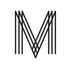
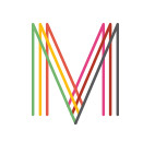
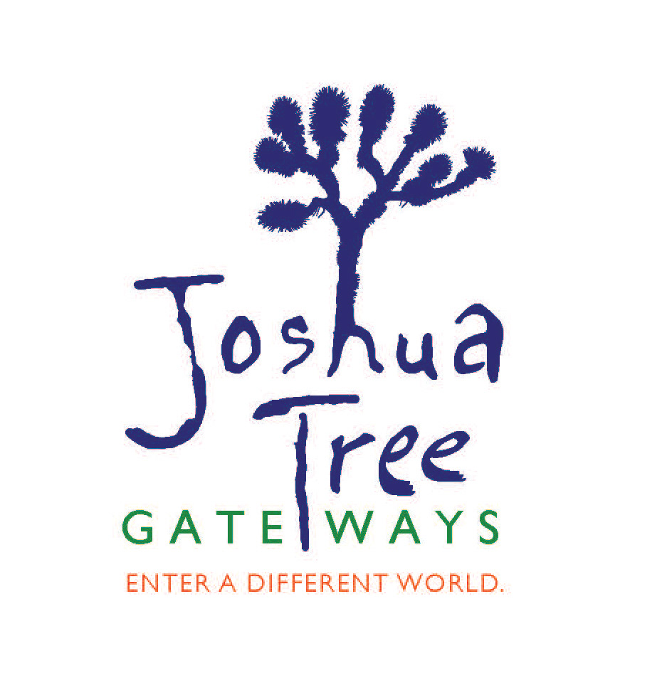
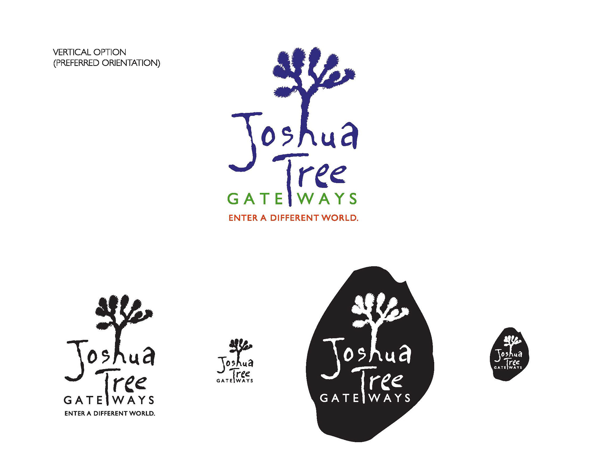
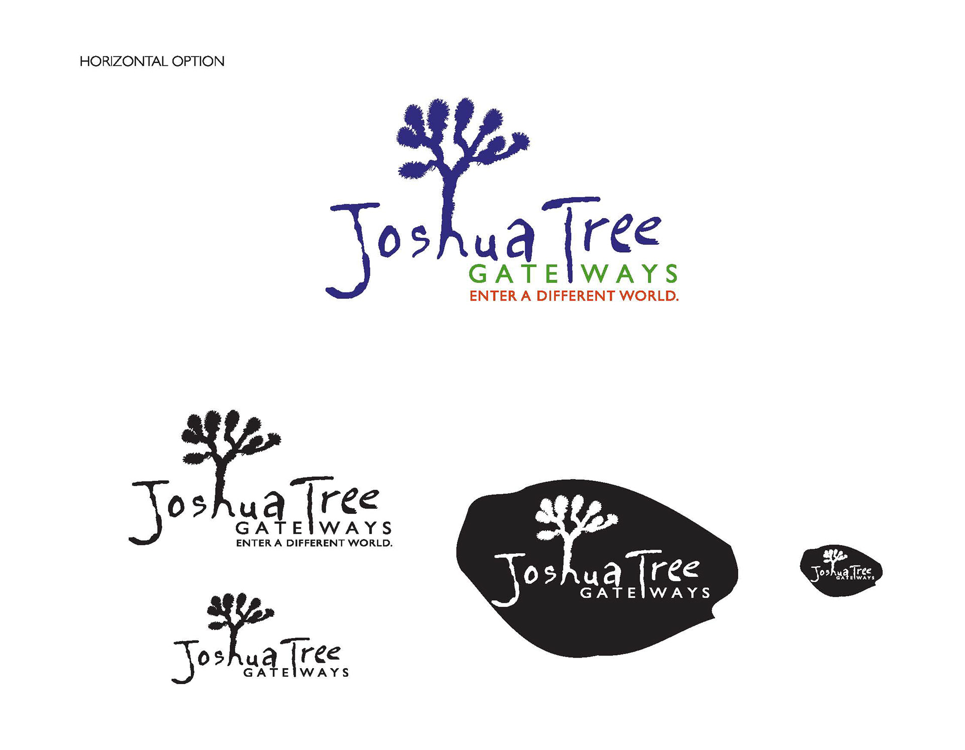
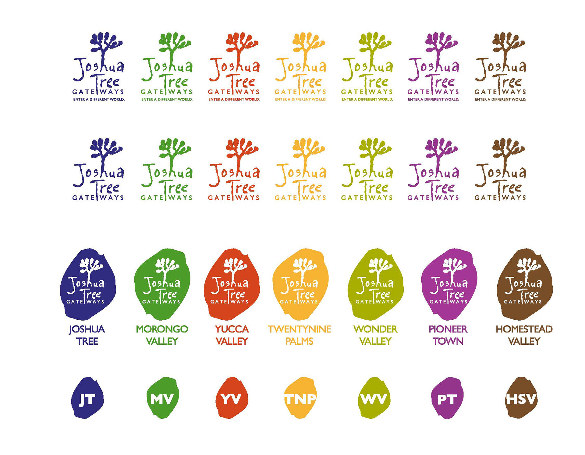
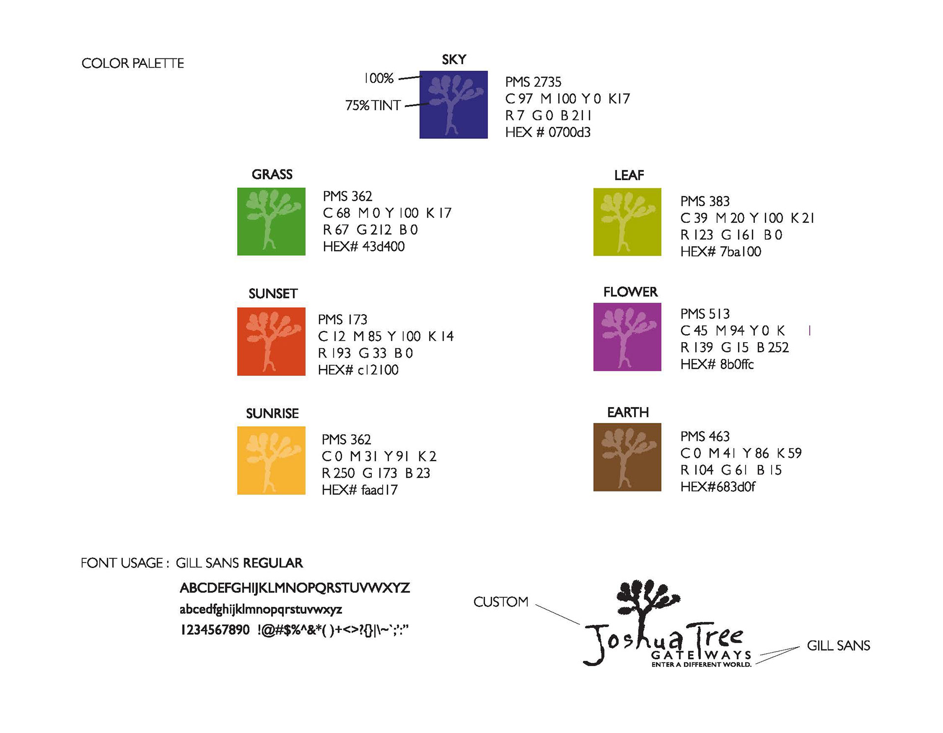
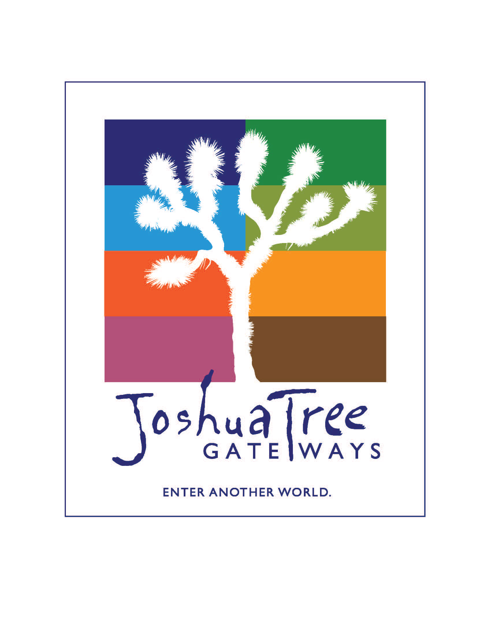
CLIENT | JOSHUA TREE GATEWAYS
The Joshua Tree in this logo has 8 arms that symbolize the 8 communities and how they work together. The artistic font is loose and free, much like the aura surrounding this unique community and all it stands for. I chose 8 vibrant colors from the high desert in Joshua Tree to give each city its own unique visual que.
PROJECTS COMPLETED Logo, Visual guidelines and Poster
_______________________________________________________________________
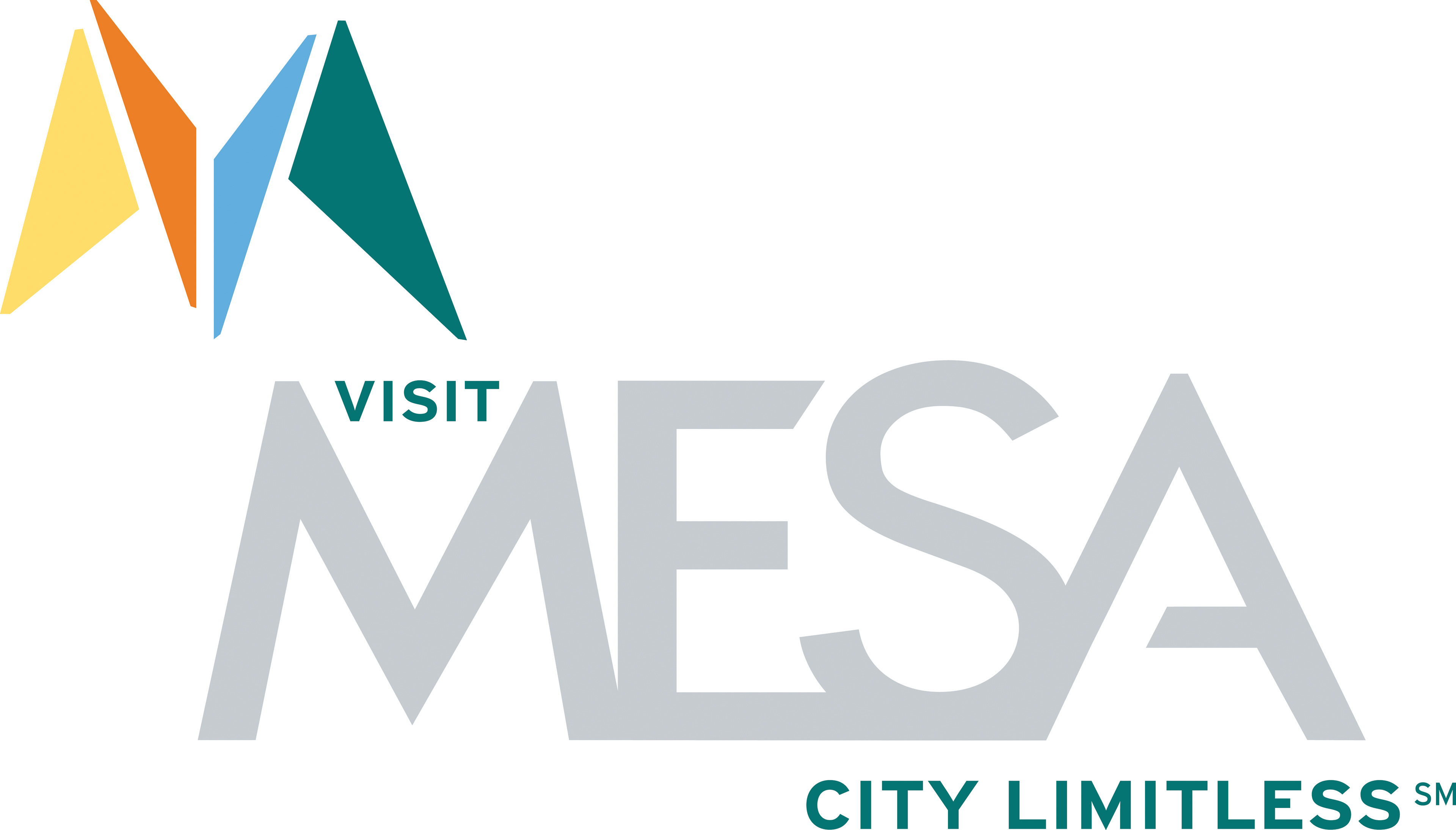
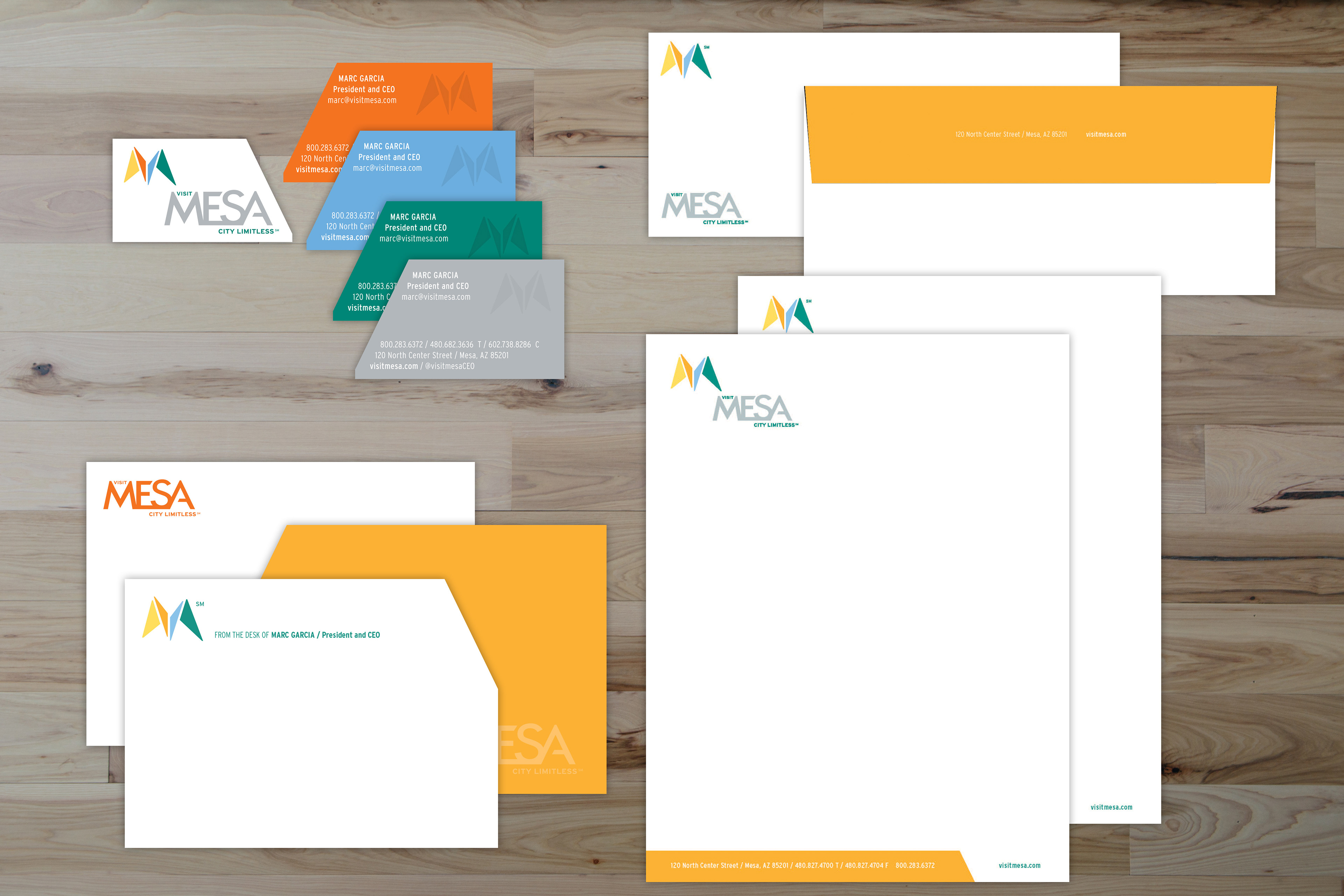
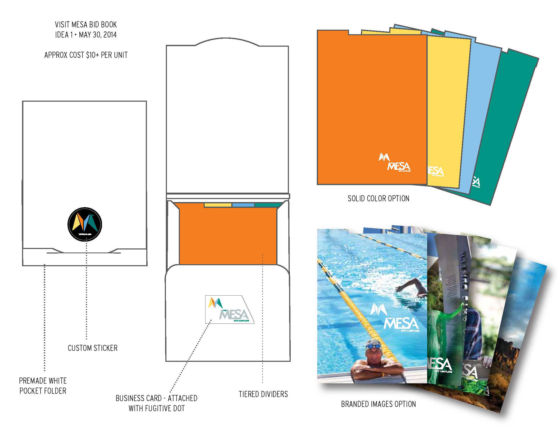
CLIENT | VISIT MESA
I collaborated on this amazing project with Jeff Miraglia from Mindset, Inc. His strategy of CITY LIMITLESS gave me the opportunity to design an identity system that was fresh and contemporary. Mesa has been often thought of as "old and tired". Mesa is far from that and as the identity came to life from the amazing brand vision. The "east valley" is alive and encompasses Mesa, Gilbert, Queen Creek and Tonto National Forest and there is more to Mesa City Limitless than one thought.
PROJECTS COMPLETED Logo, business system with personalized notecards, semi-custom cost effective "bid book"
* Project completed while working with Jeff Miraglia, Mindset LLC.
* Project completed while working with Jeff Miraglia, Mindset LLC.
____________________________________________________________________________________
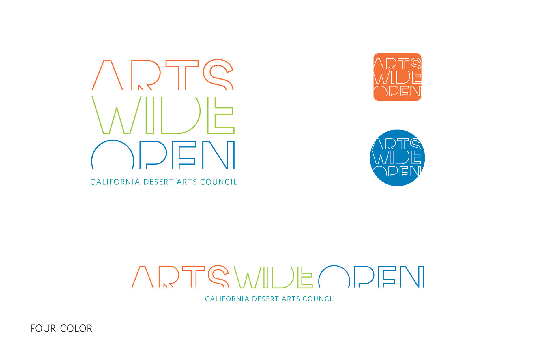
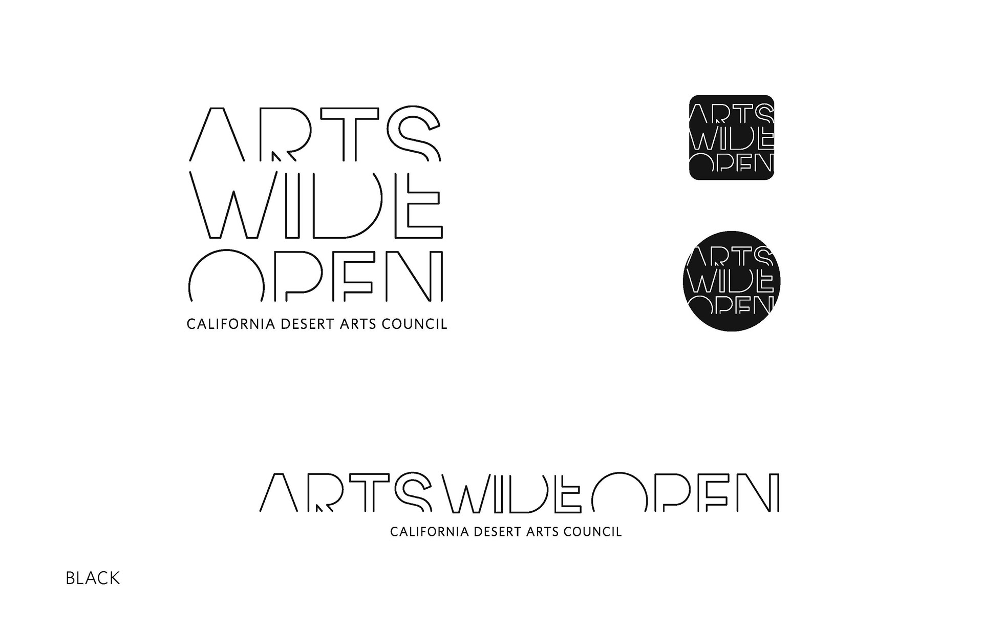
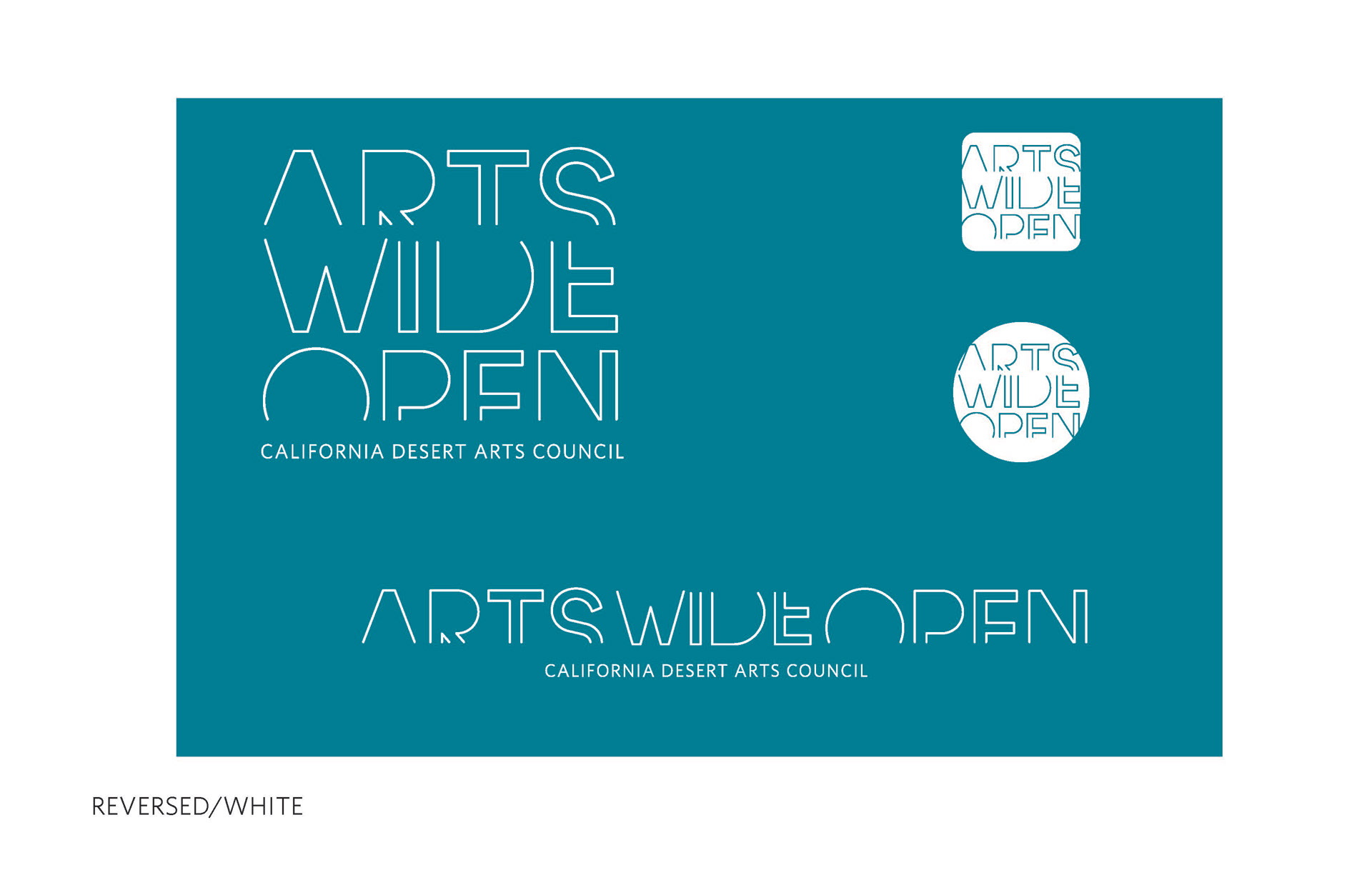
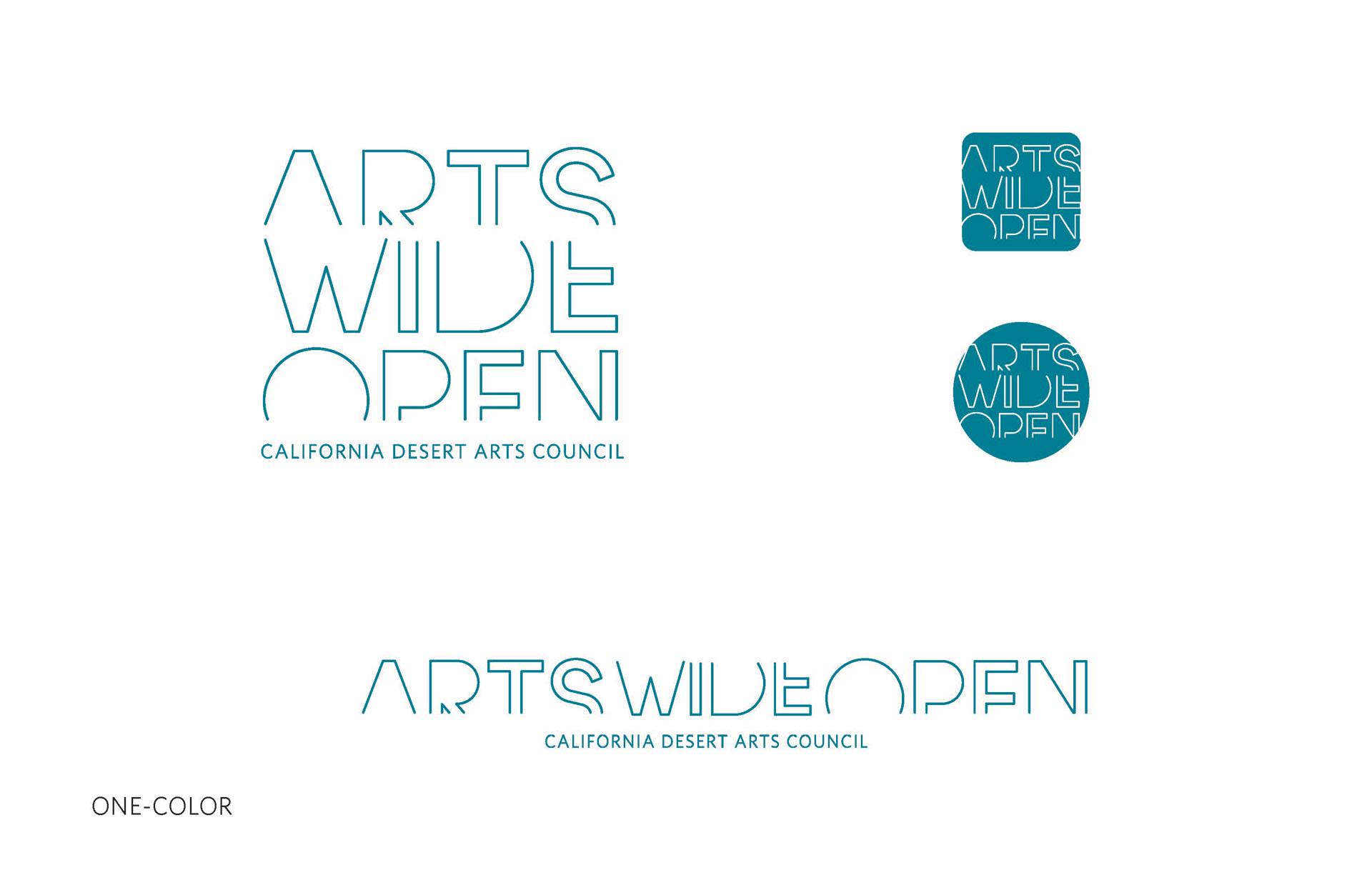
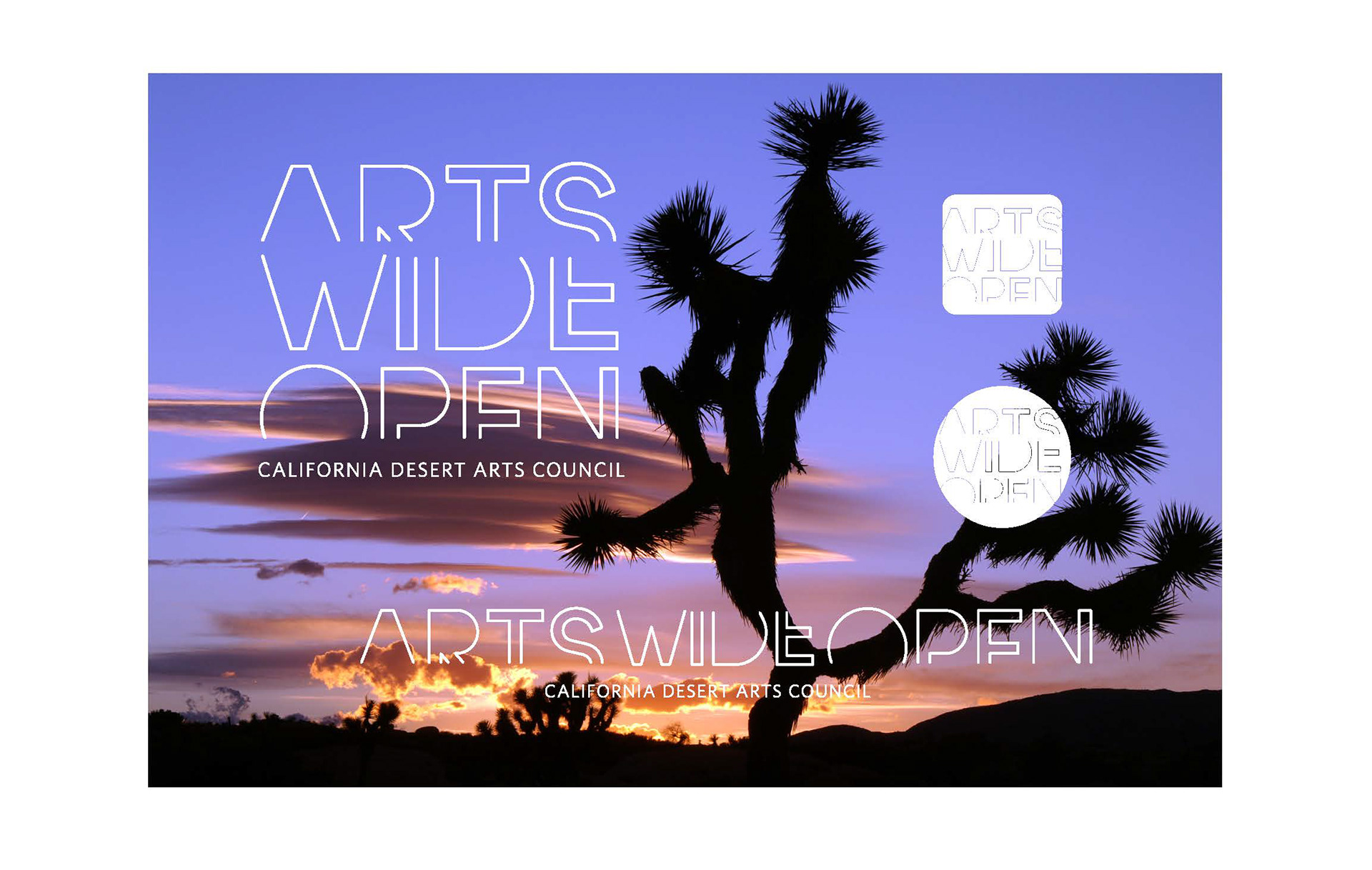
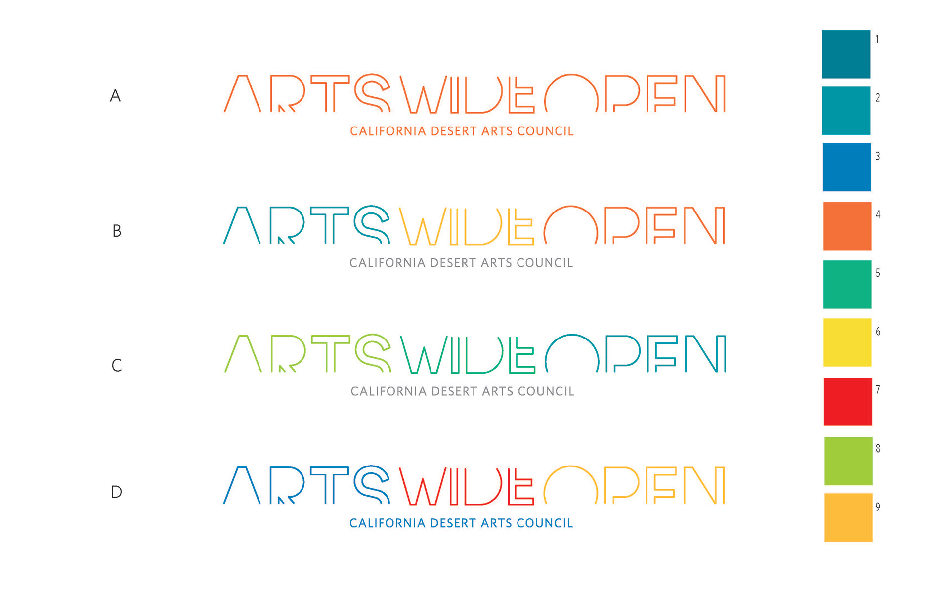
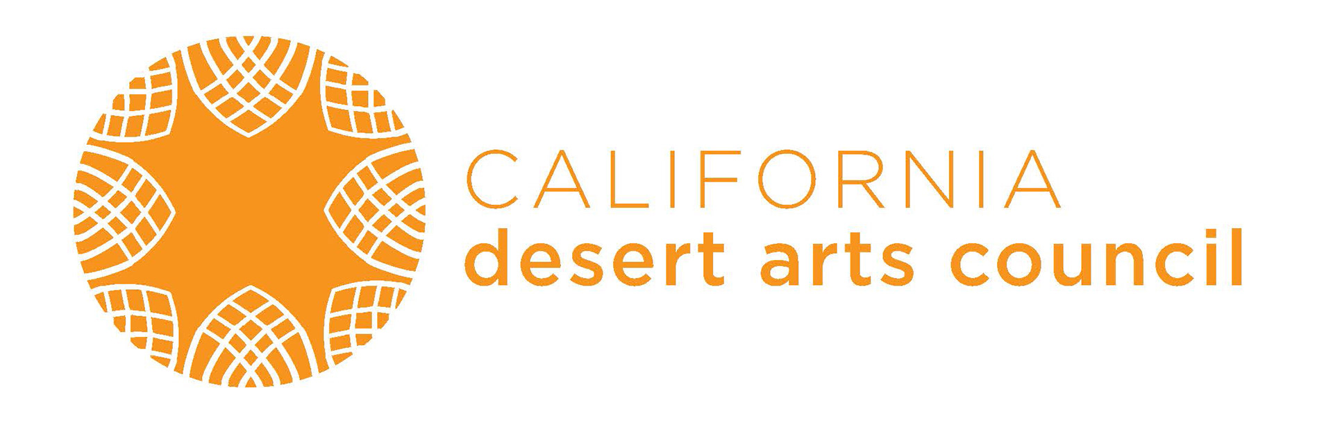
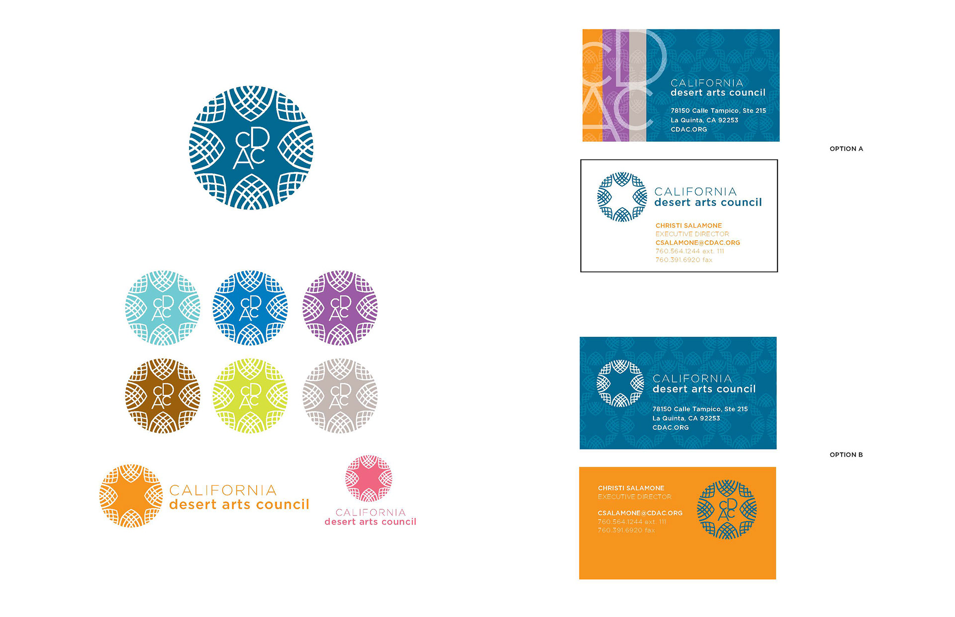
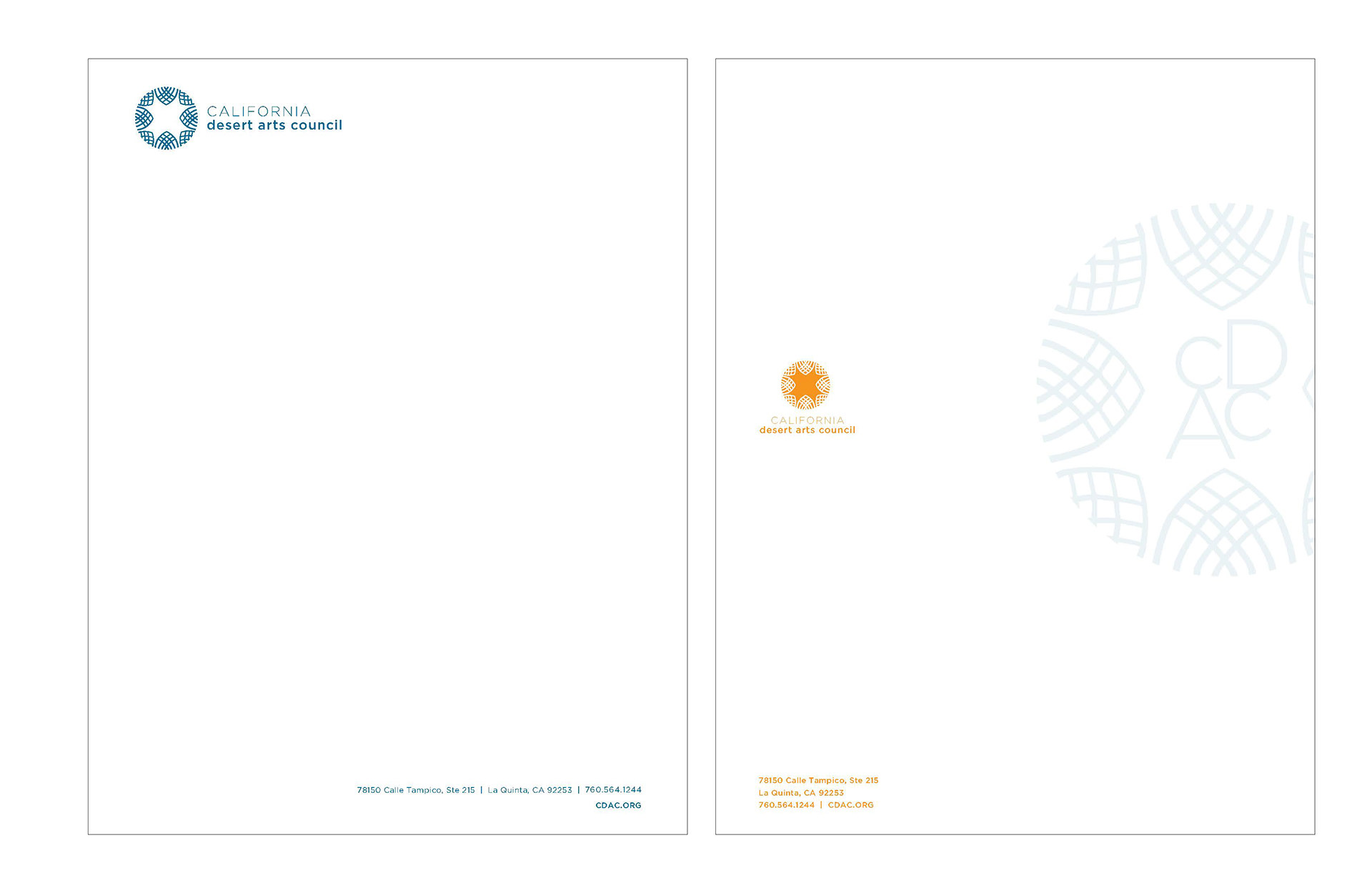
CLIENT | California Desert Arts Council
I designed a typographic logo mark that is easy to read and is "open", simplistic and effective. To help show the flexibility of the logo, I provide alternate options (for social and small spaces), one-color and reversed, and different lockups (vertical or horizontal). Color plays a very important role and I provided color palette options as well.
I designed a typographic logo mark that is easy to read and is "open", simplistic and effective. To help show the flexibility of the logo, I provide alternate options (for social and small spaces), one-color and reversed, and different lockups (vertical or horizontal). Color plays a very important role and I provided color palette options as well.
______________________________________________________________________________________________________________
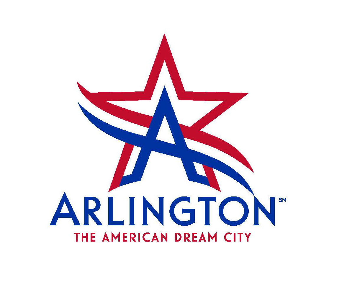
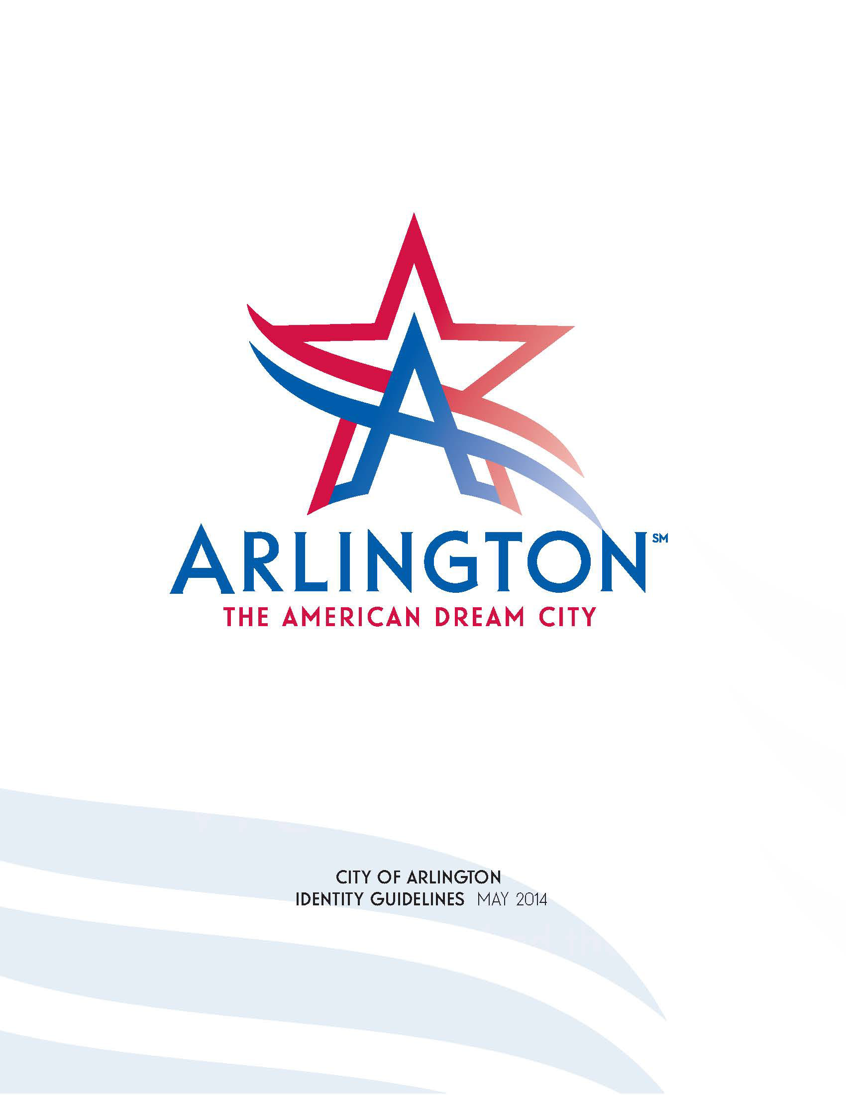
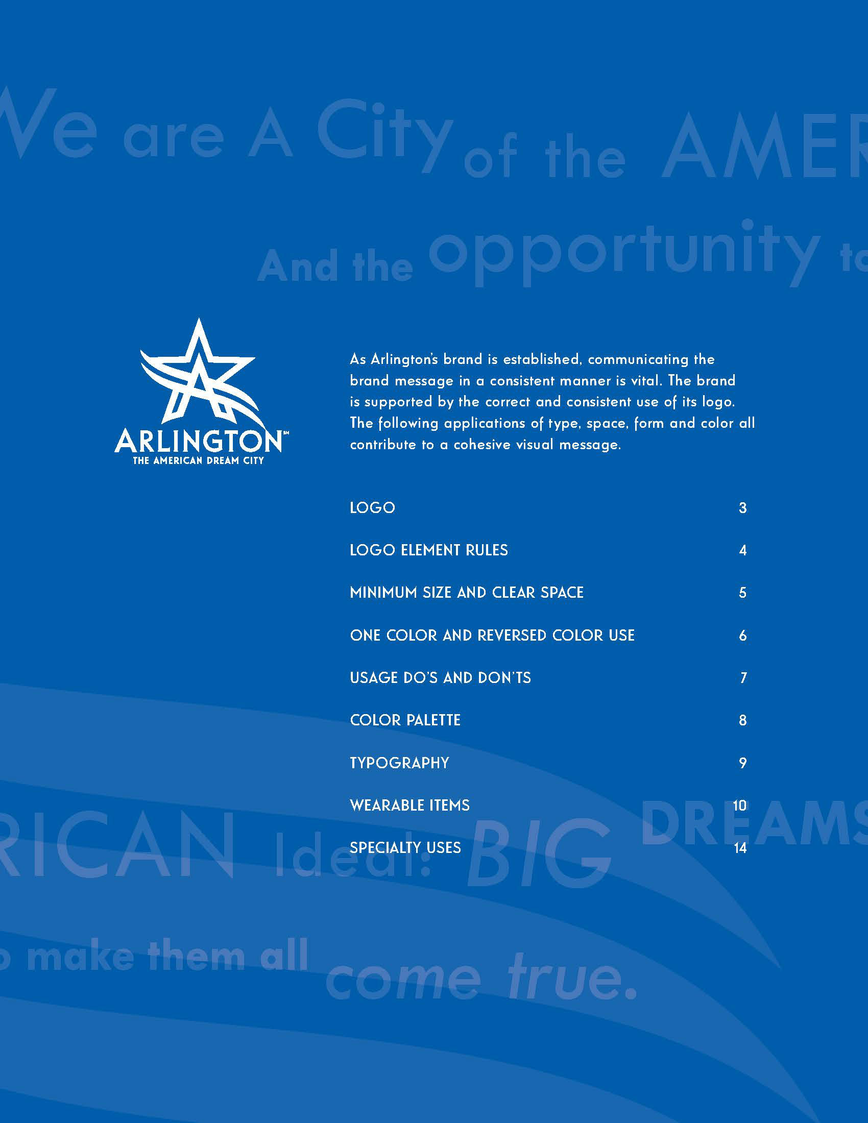
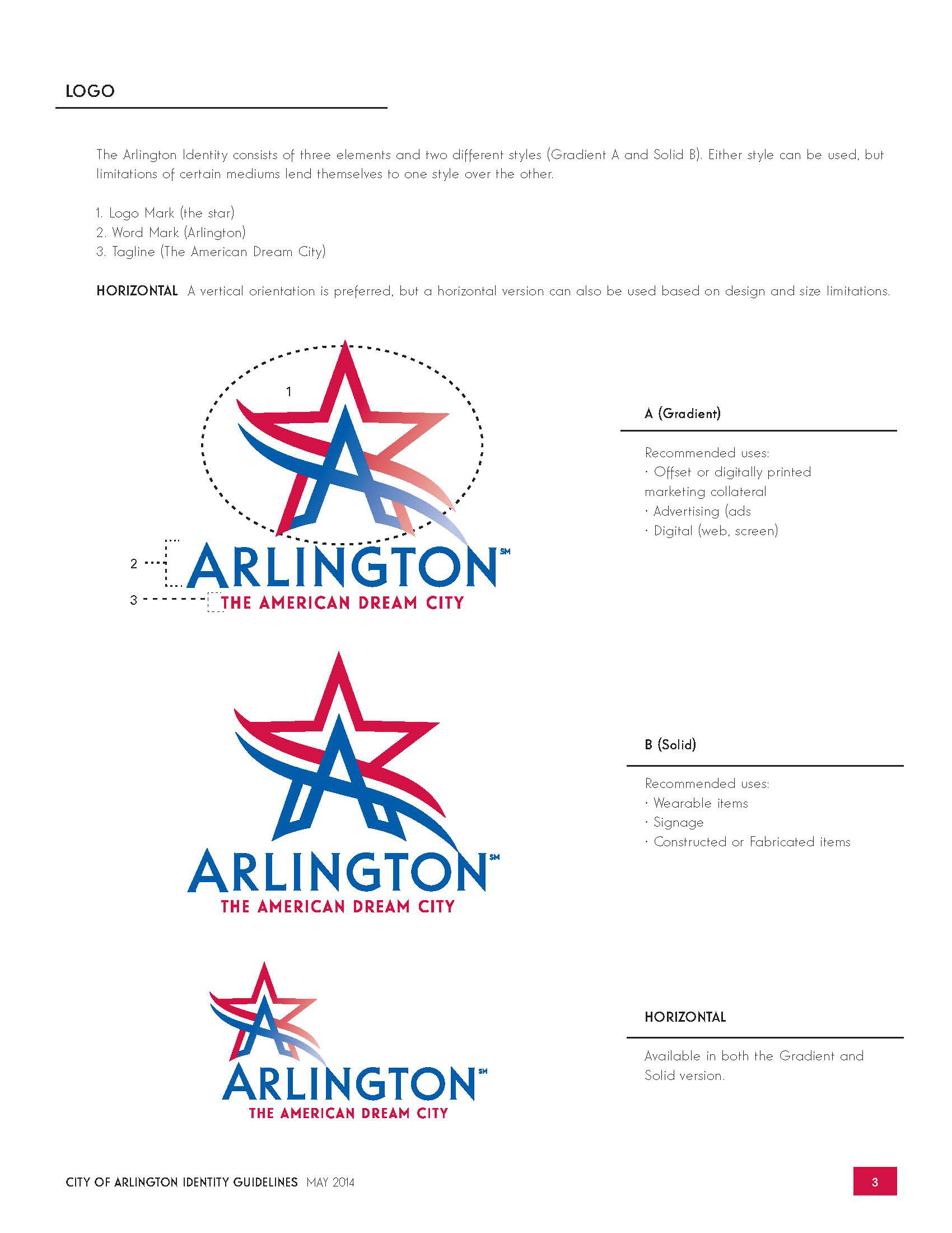
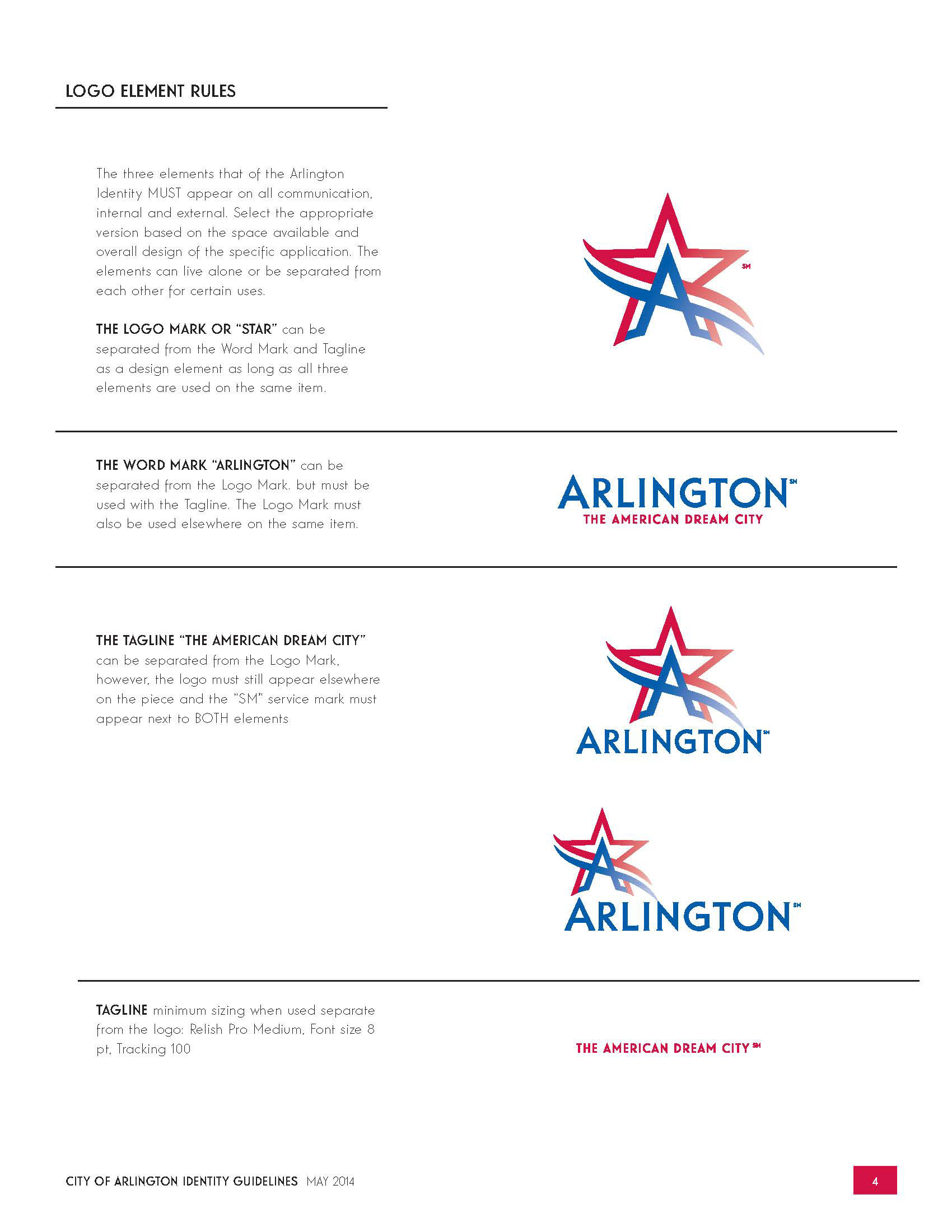
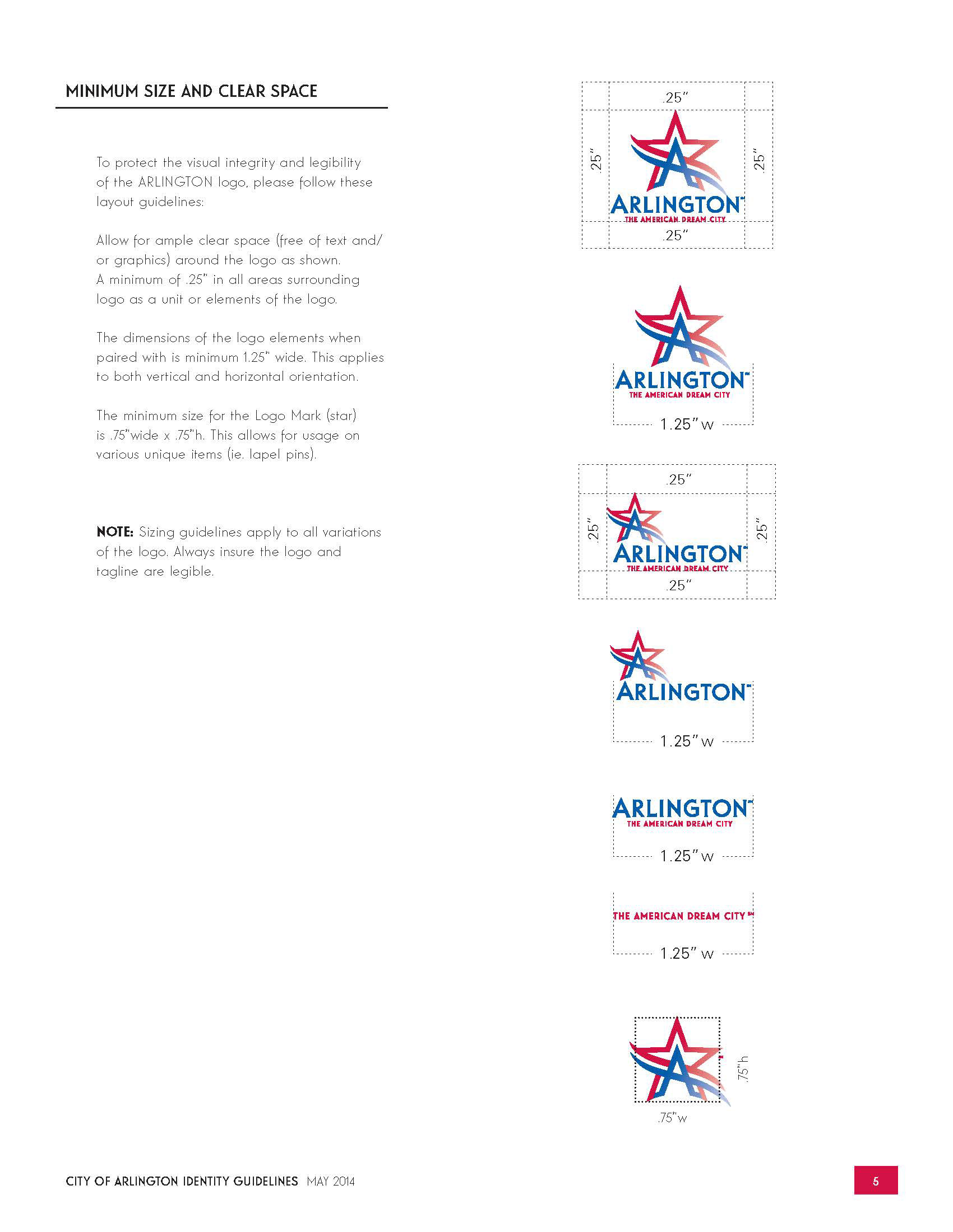
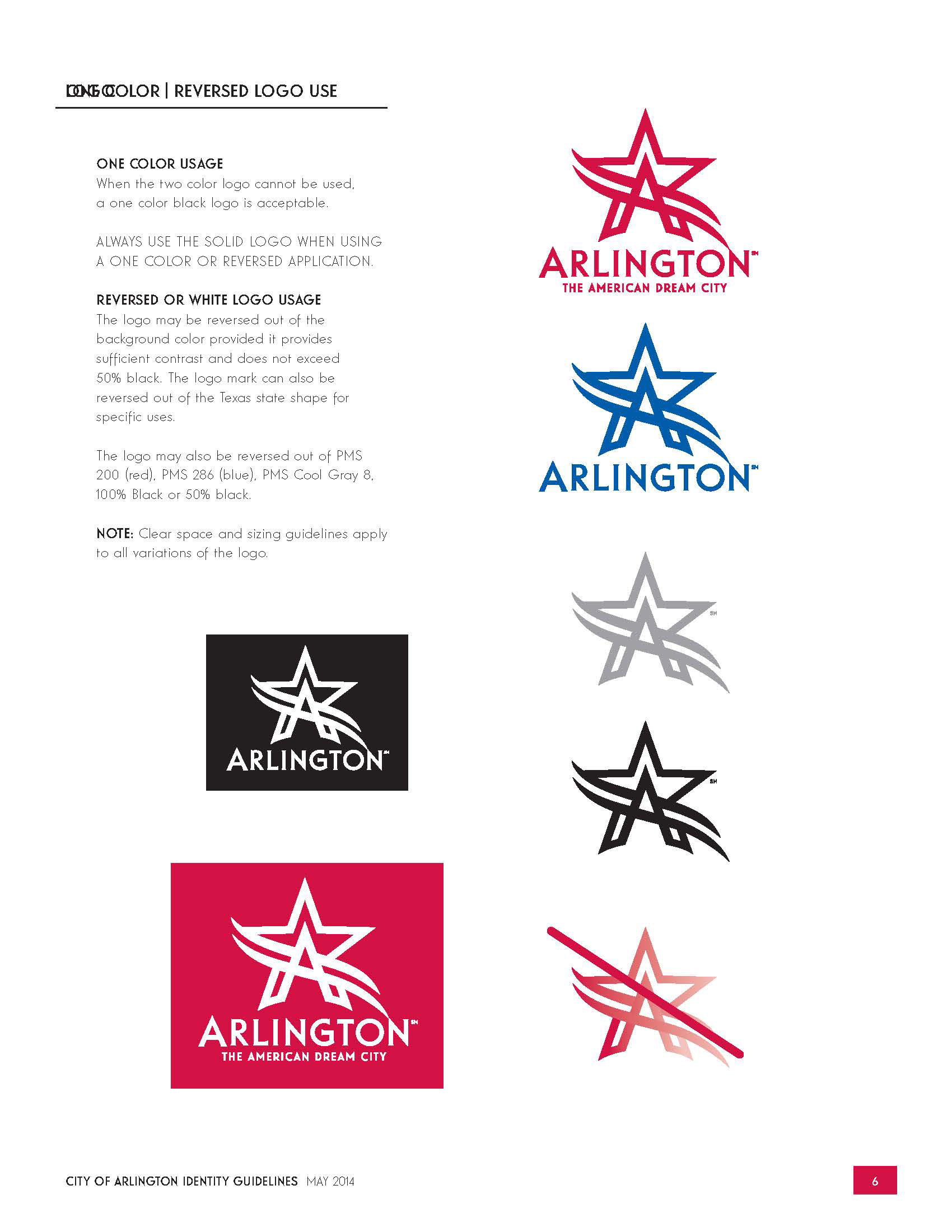
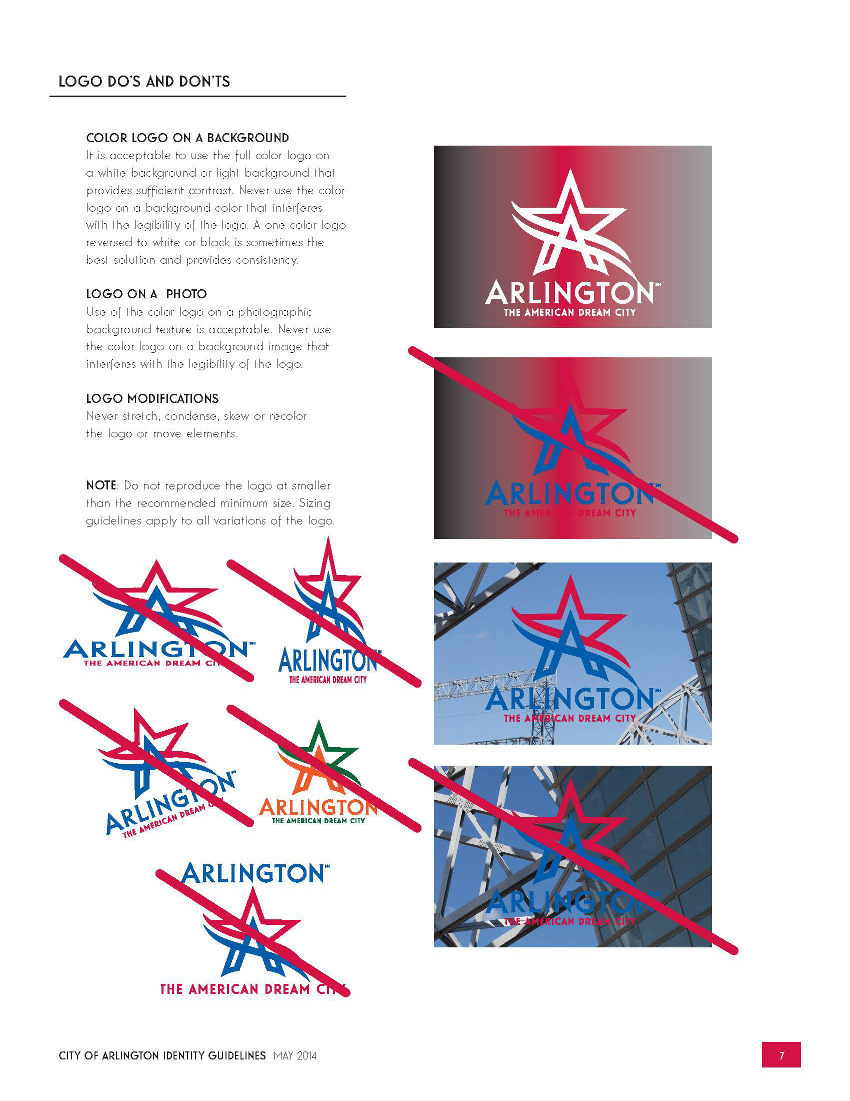
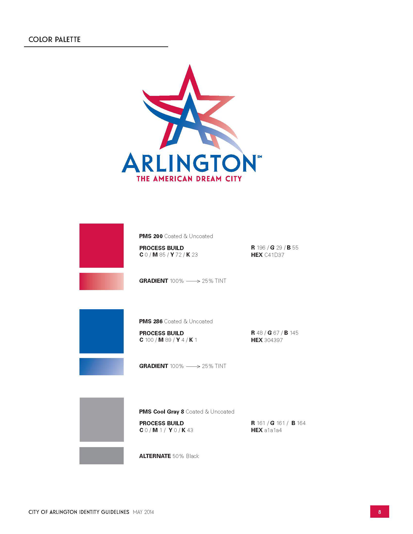
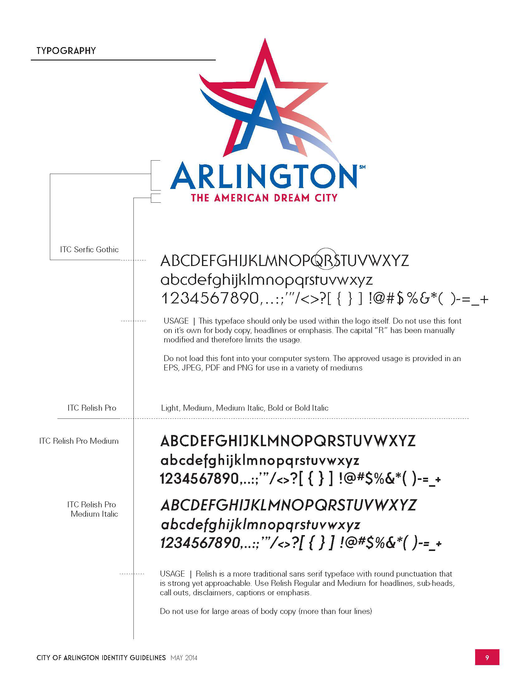
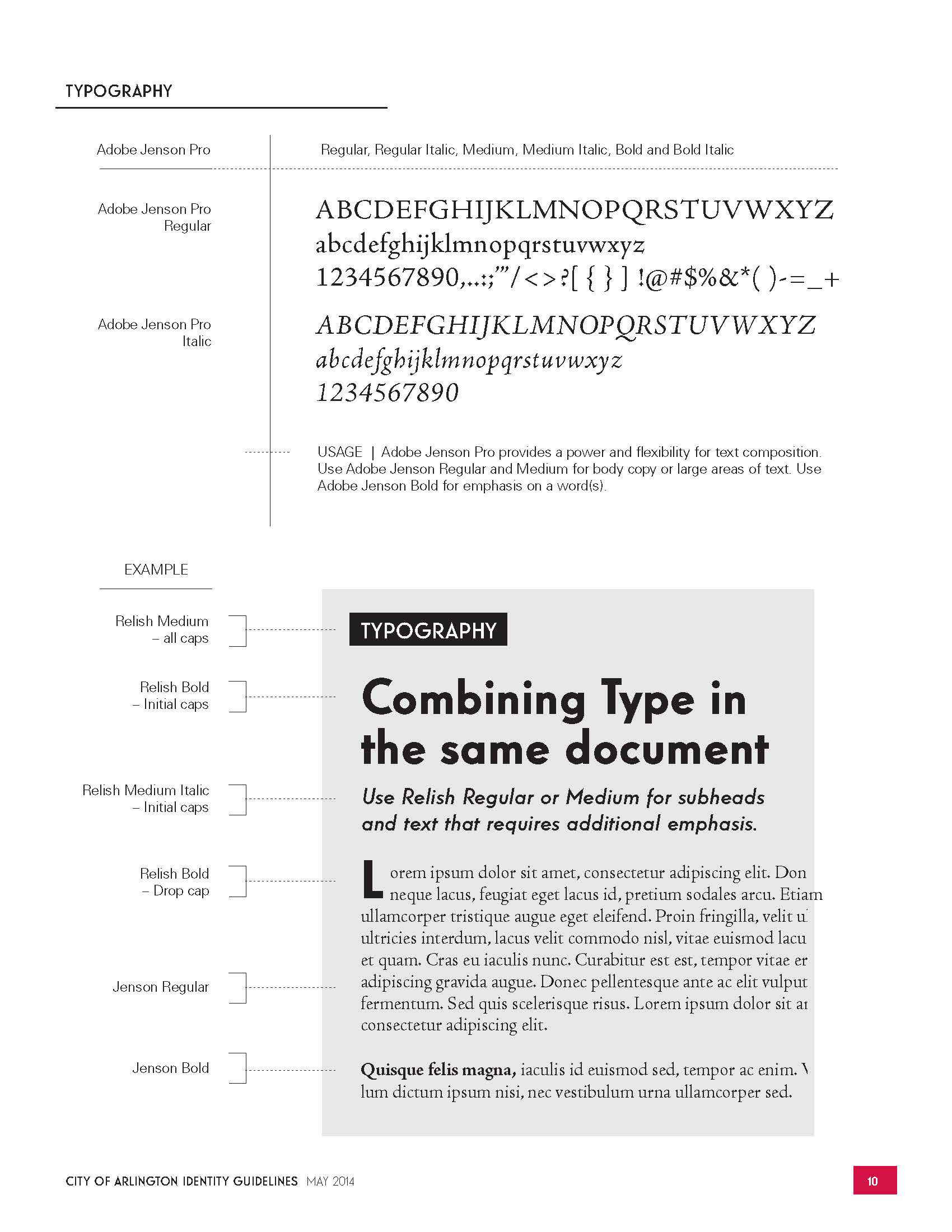
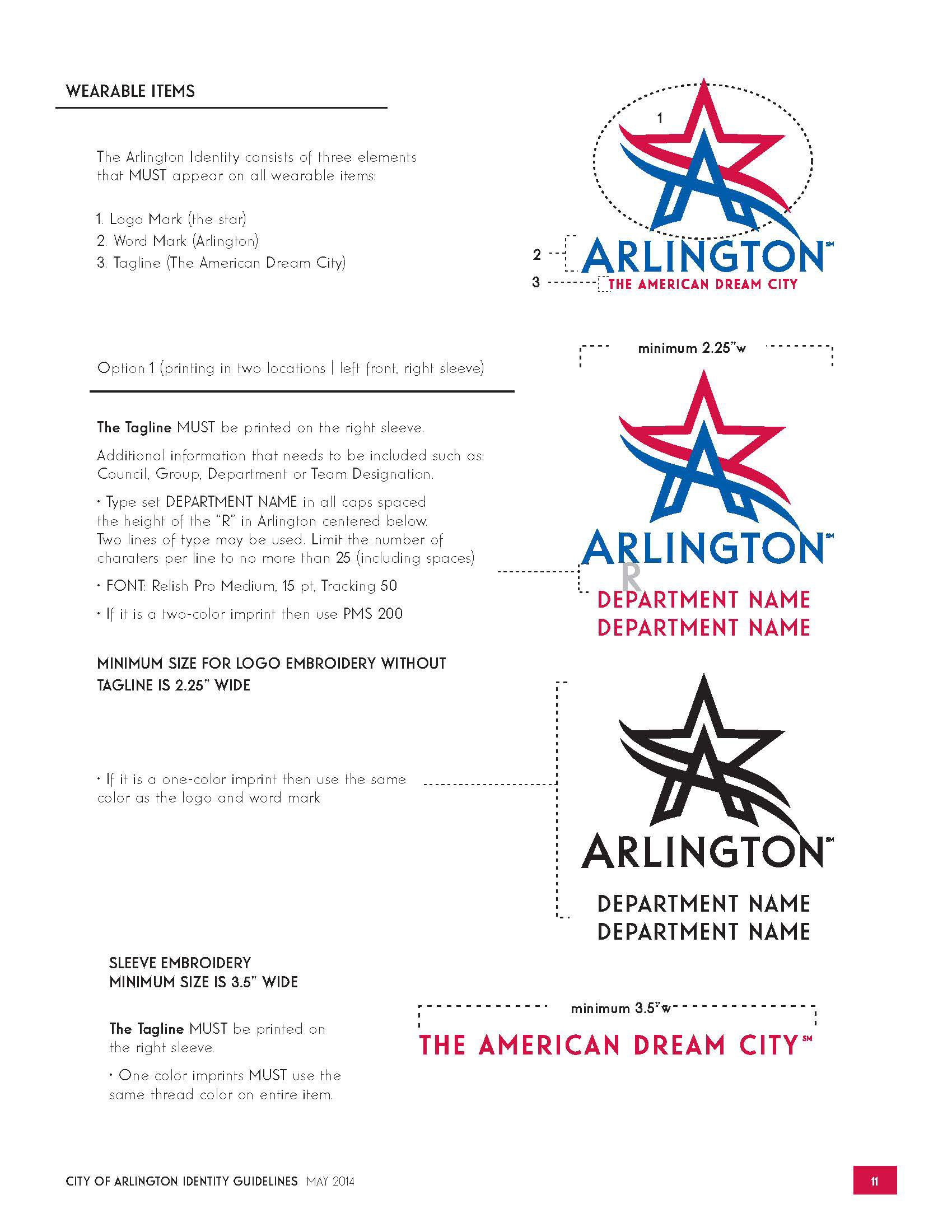
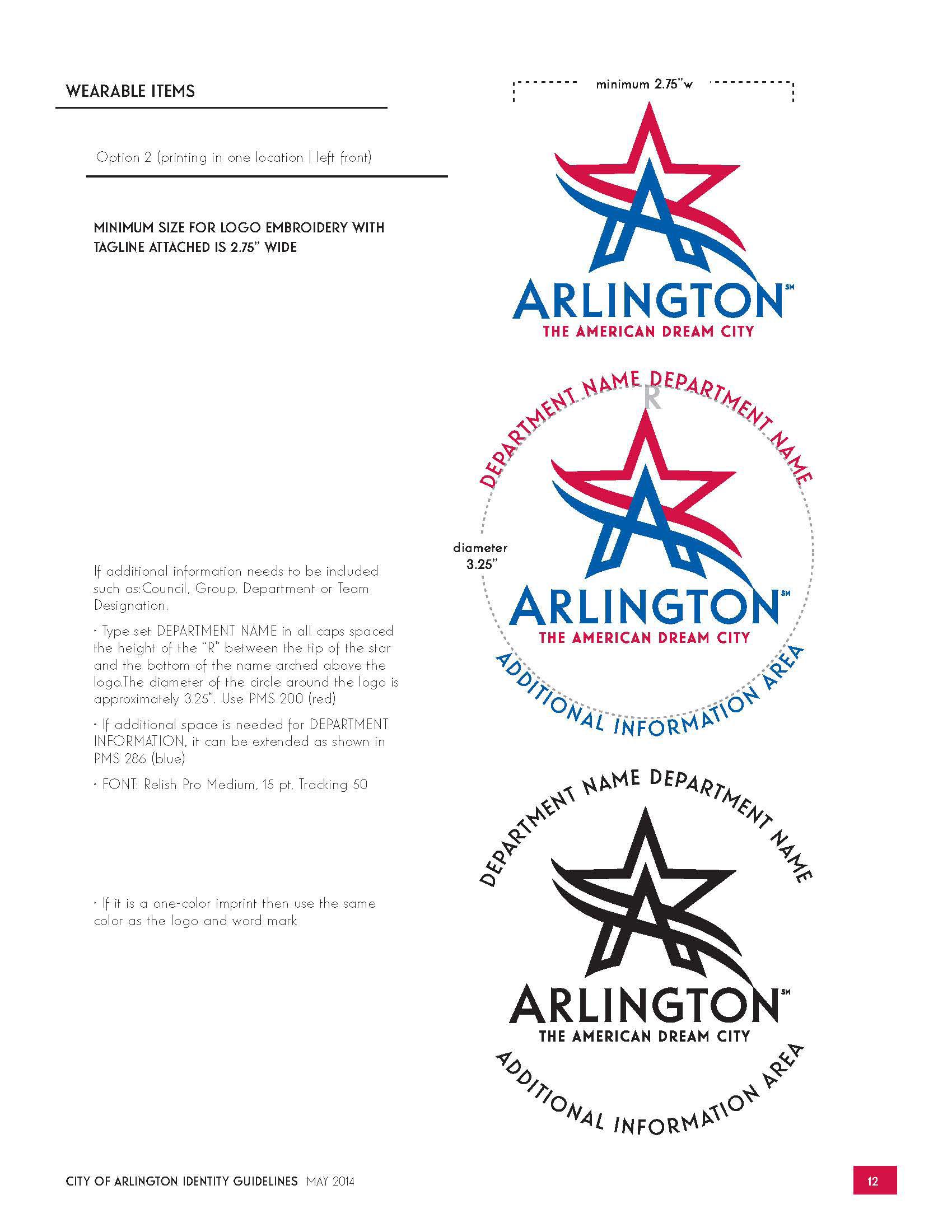
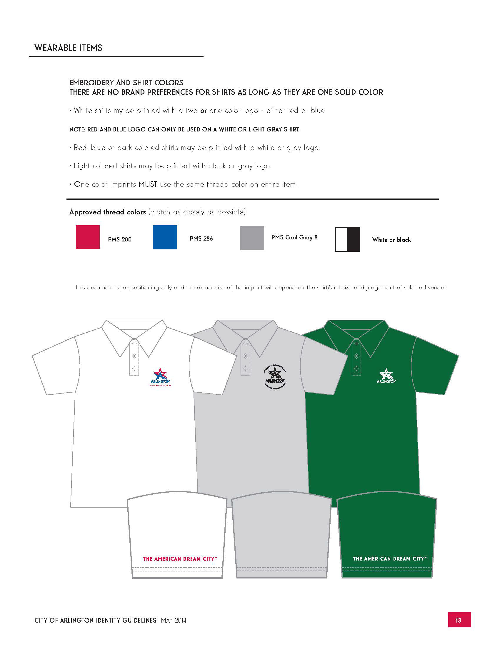
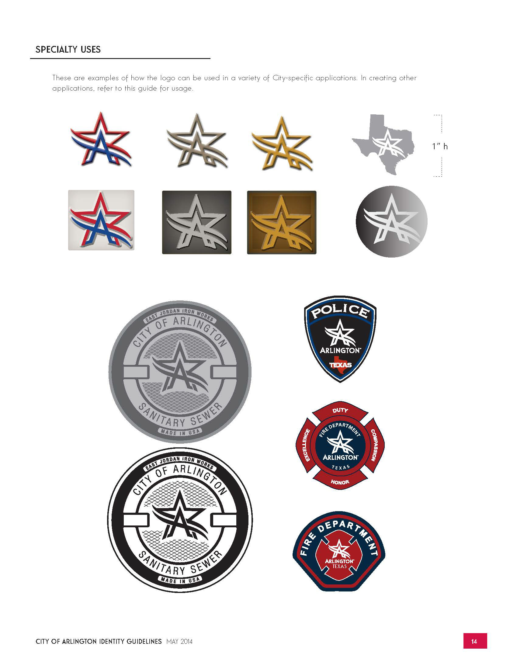
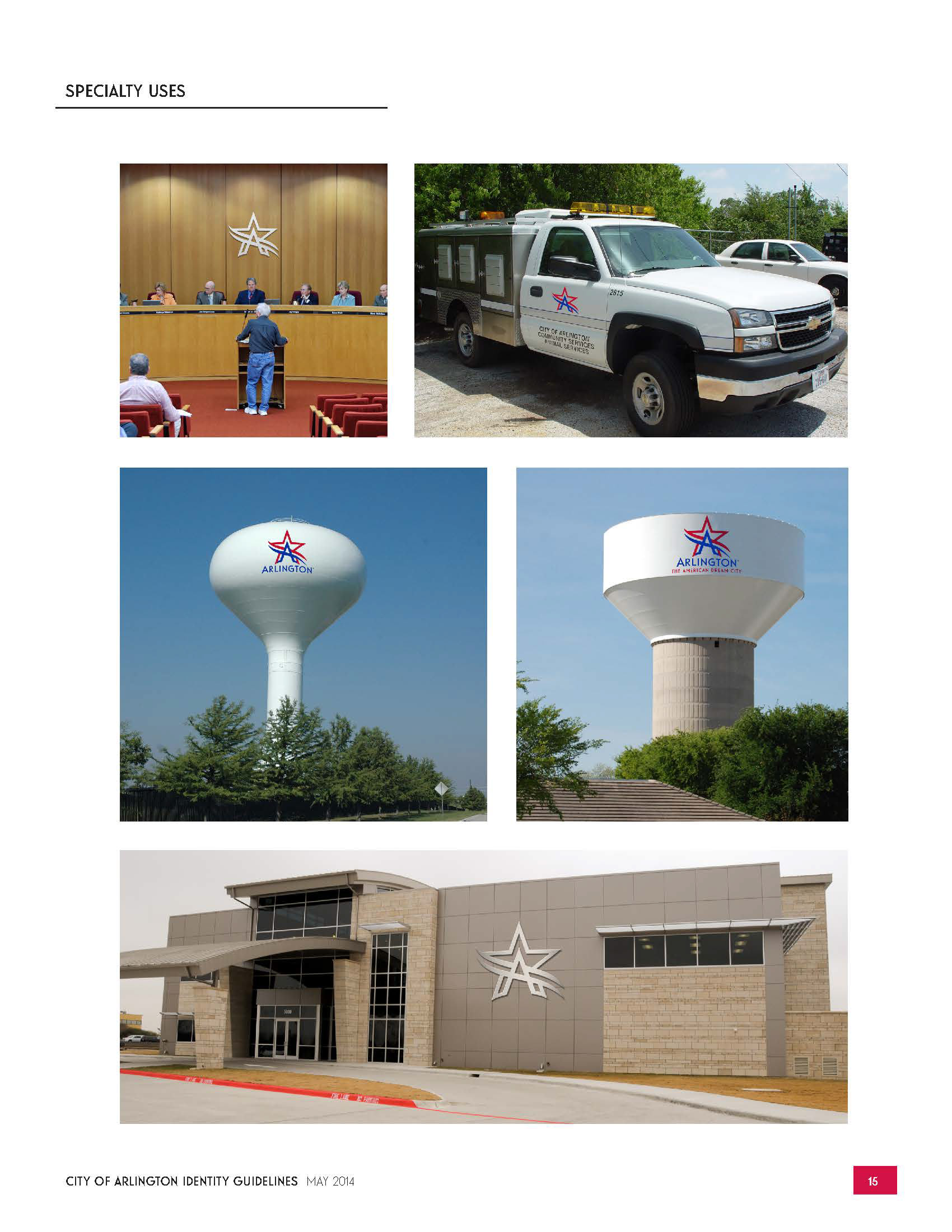
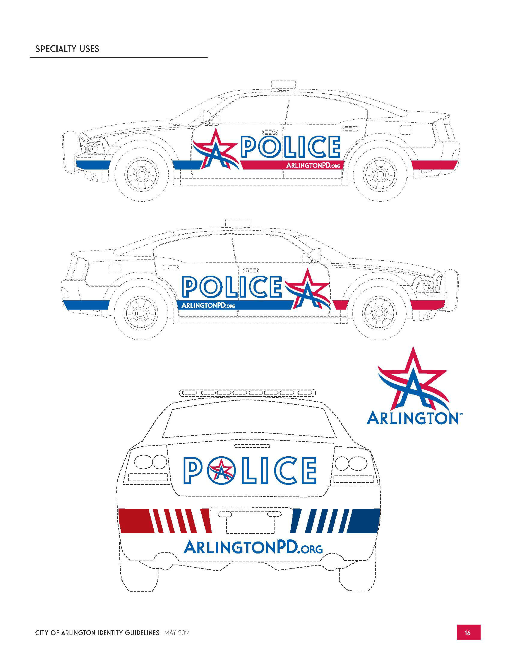
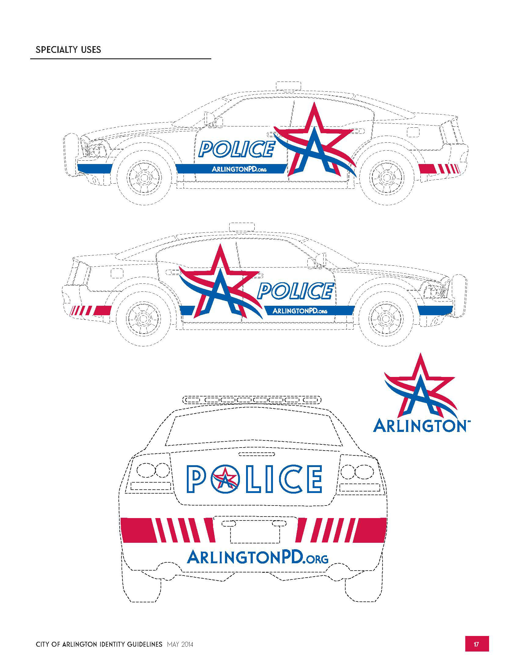
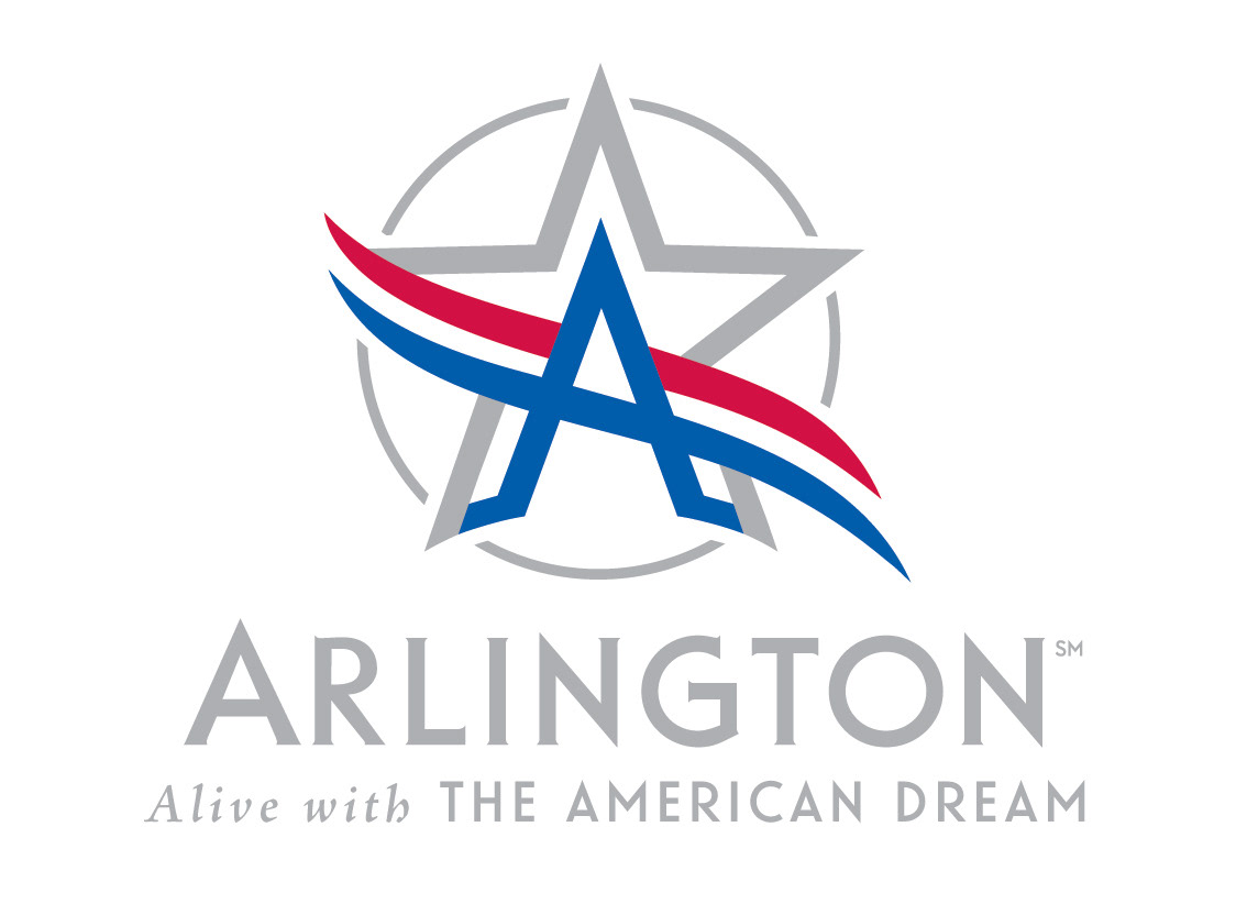
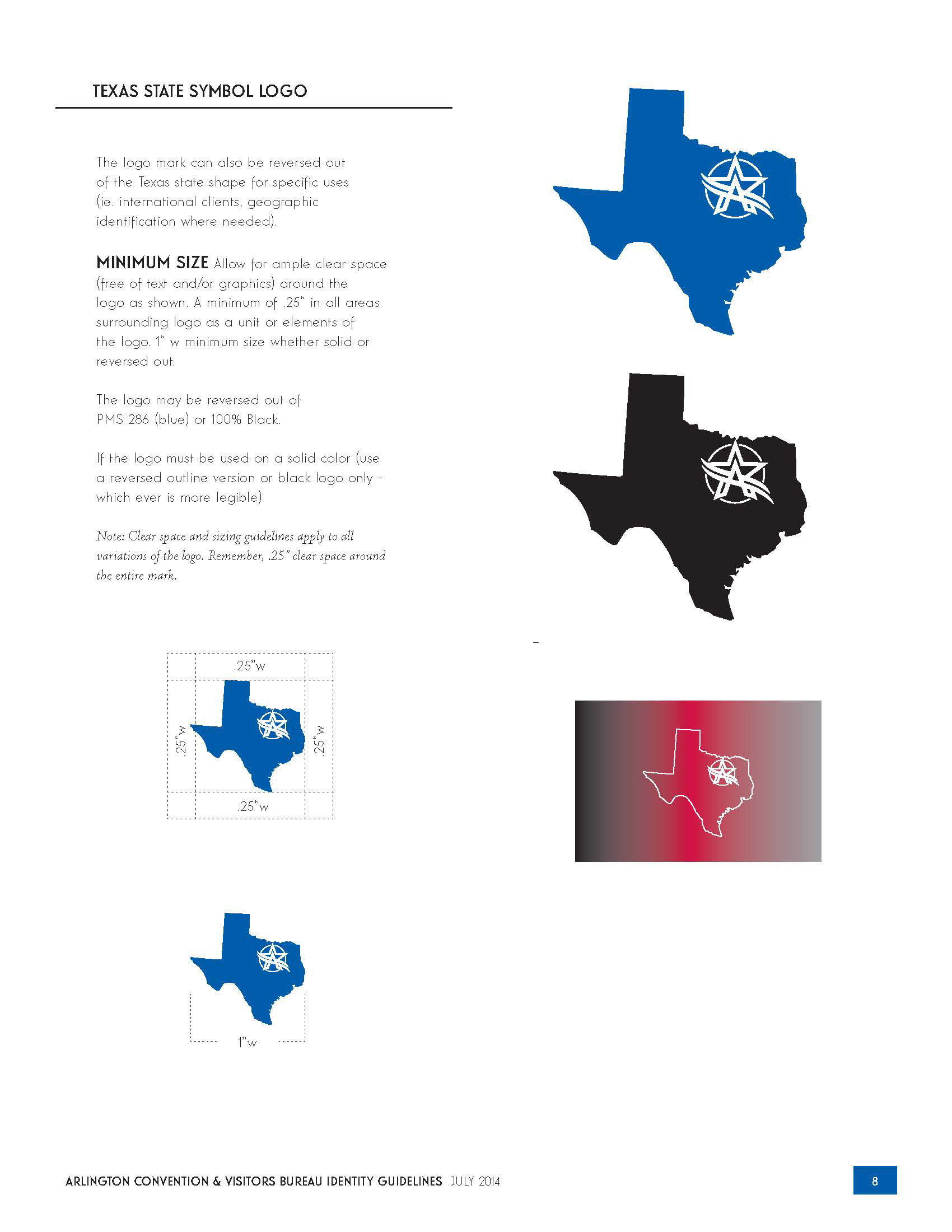
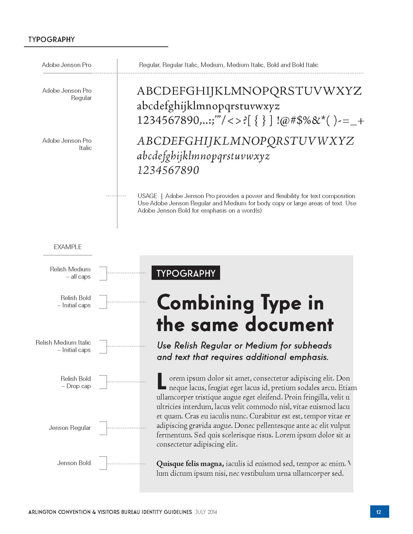
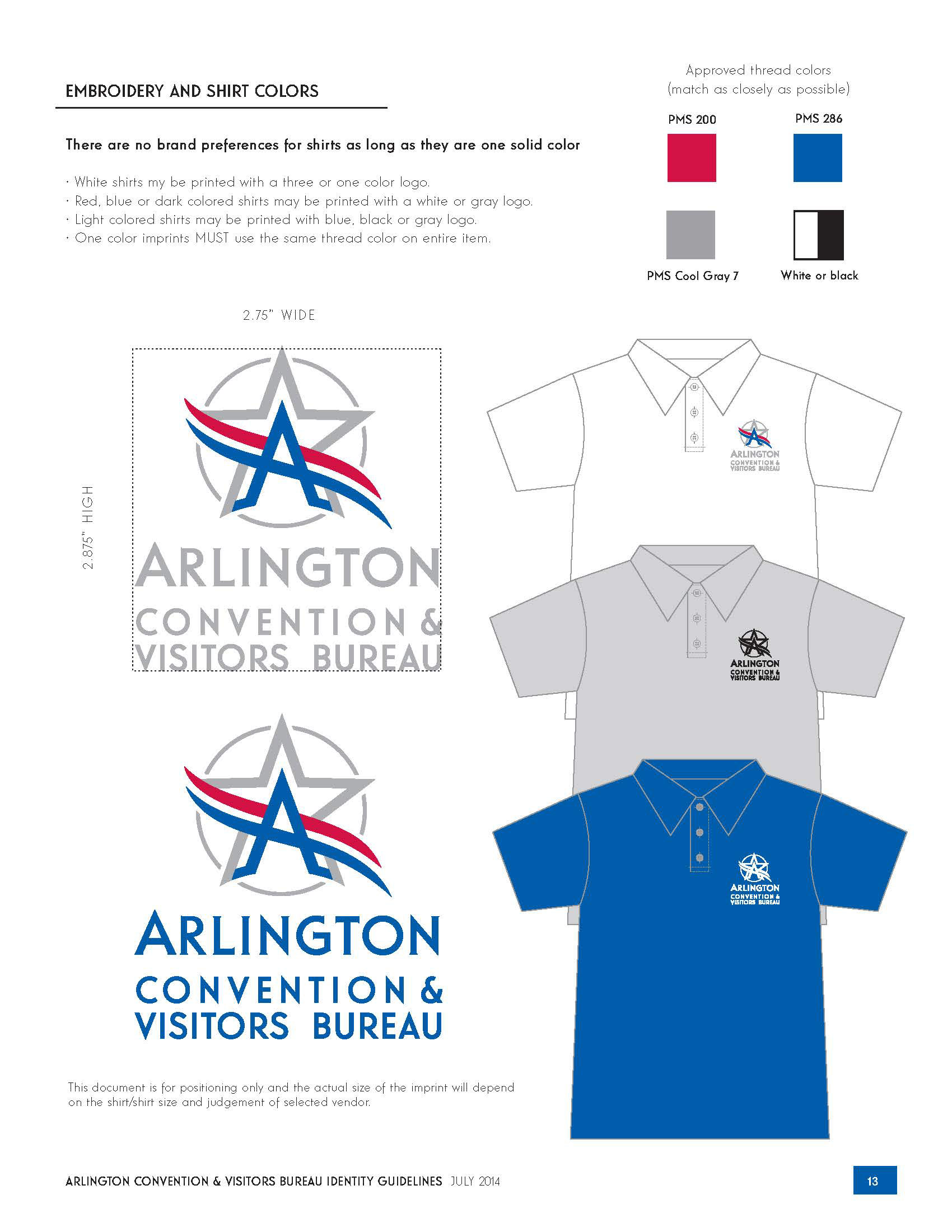
CLIENT | The City of Arlington, Texas
Working closely with Jeff Miraglia, Creative Director, from Mindset, Inc. I designed a robust and "Texas true" logo that was flexible and dynamic. I designed and directed the logo usage on so many city items, from the embroidered shirts, to the water tower, to the police cars. The brand development of "The American Dream City" can be viewed by clicking the link below.
PROJECTS COMPLETED Logo, Visual Guidelines, Website Reskin and much more...
* Project completed while working with Jeff Miraglia, Mindset LLC.
_______________________________________________________________________
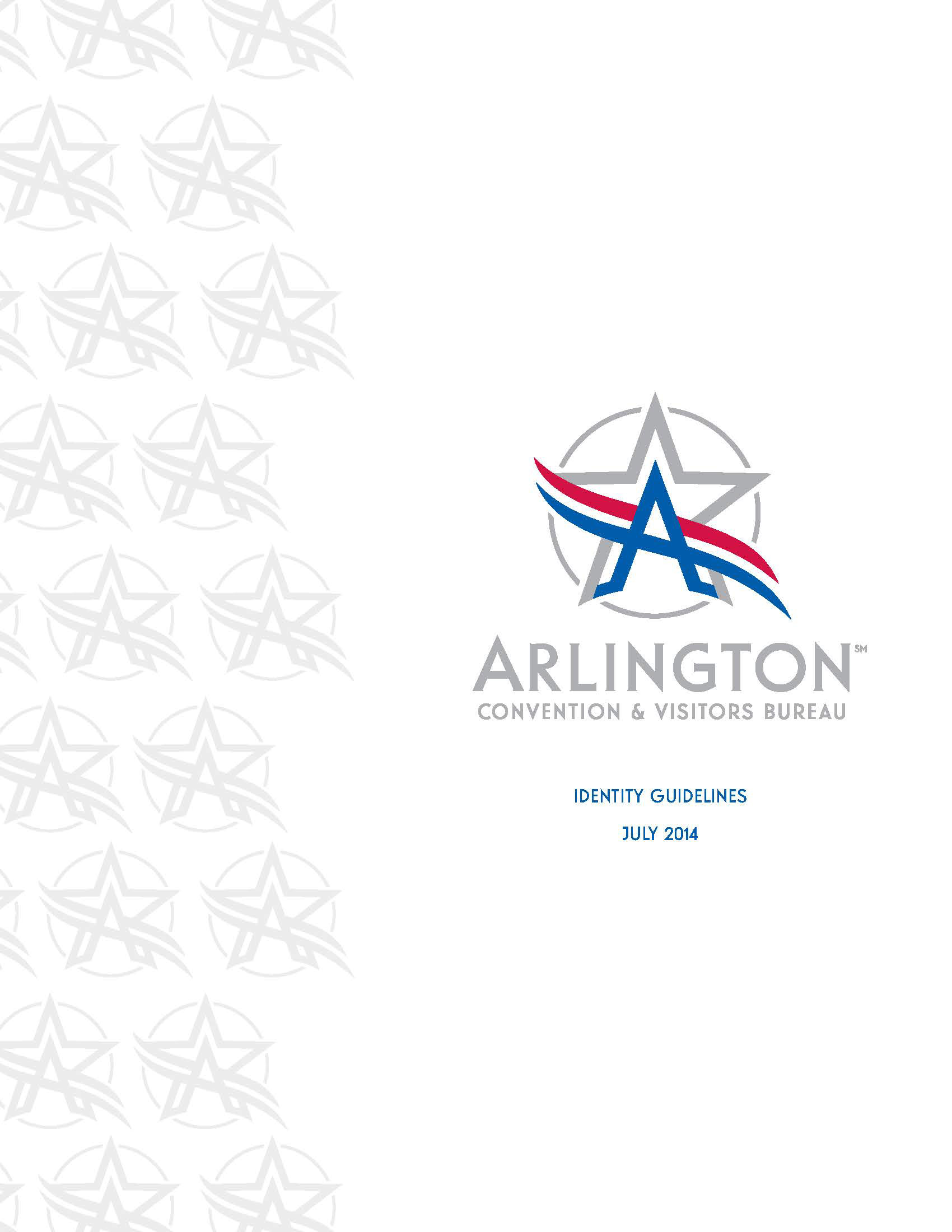
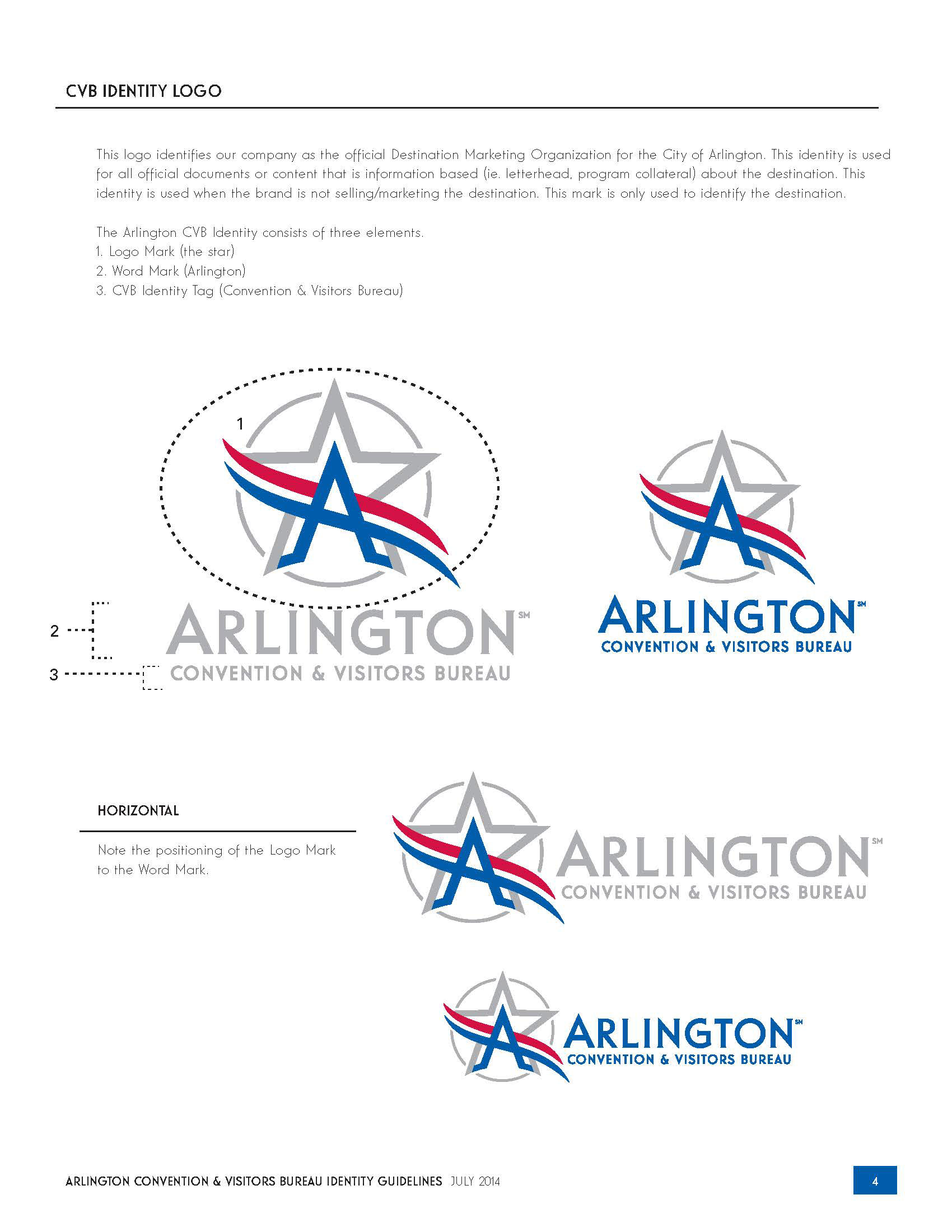
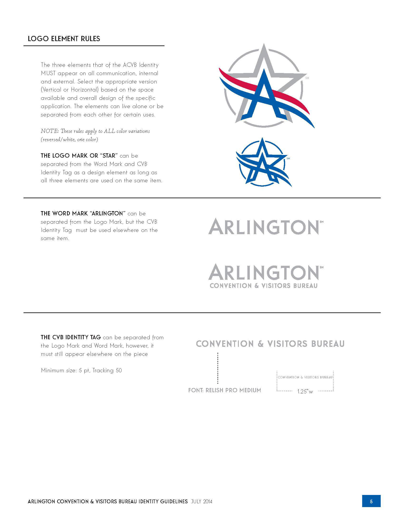
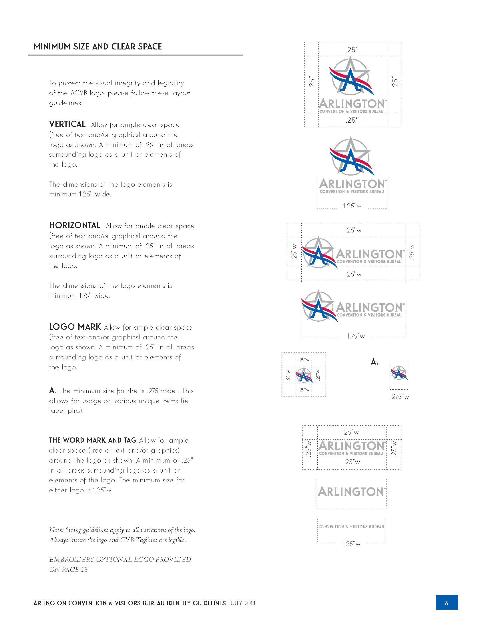
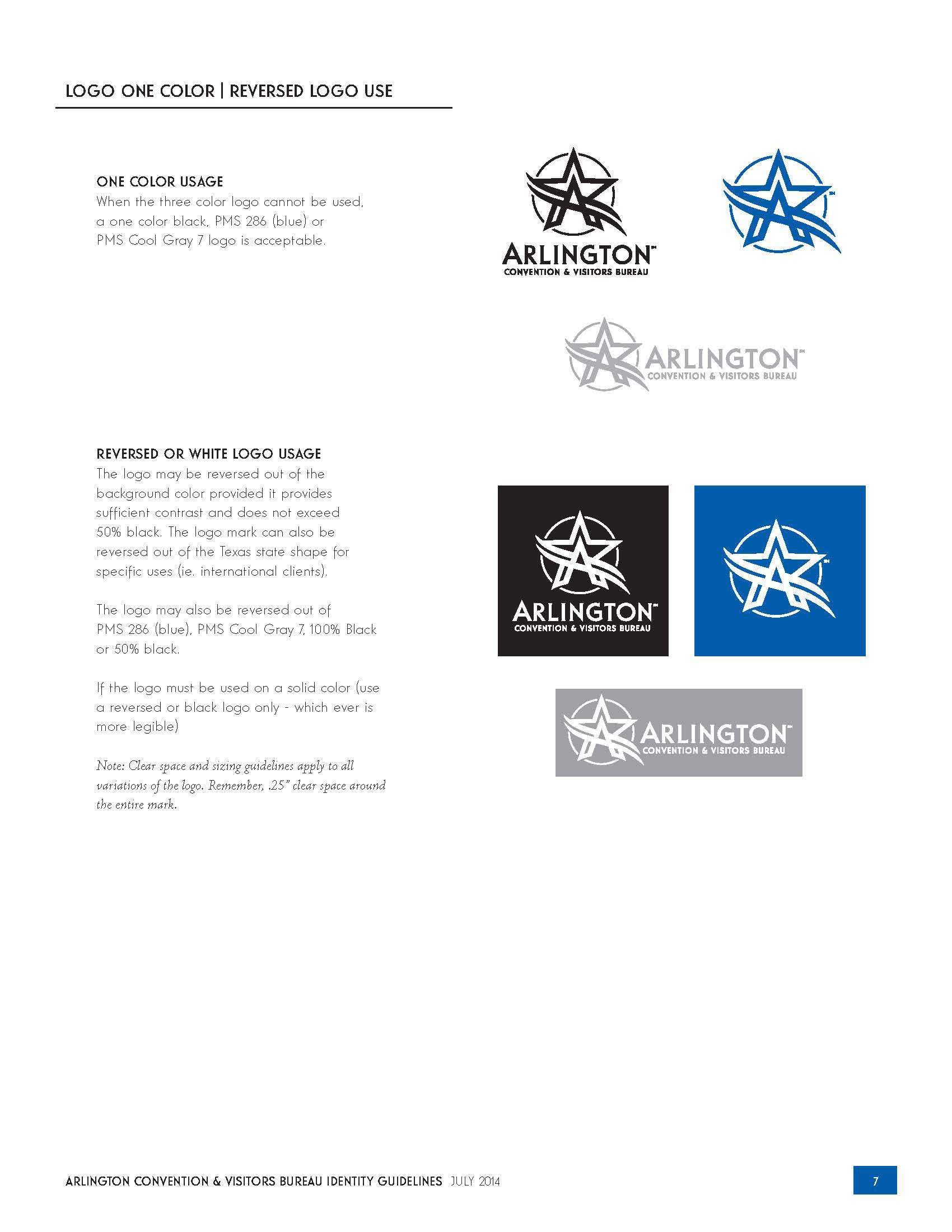
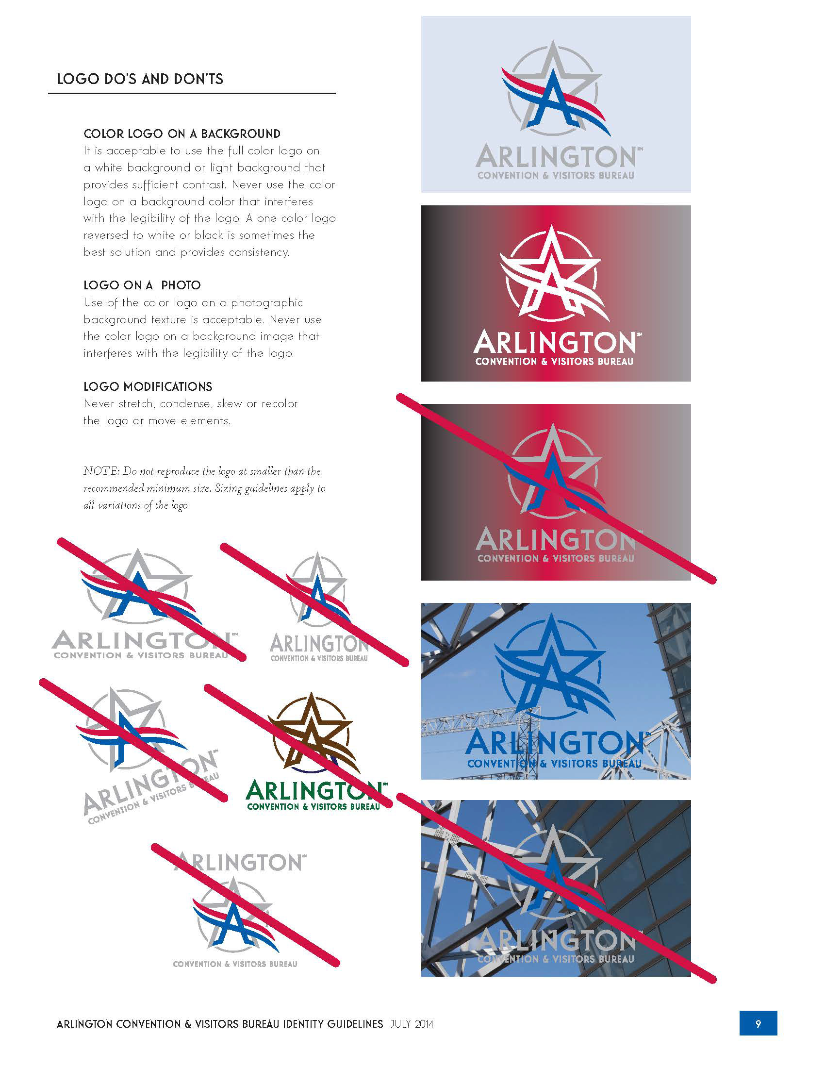
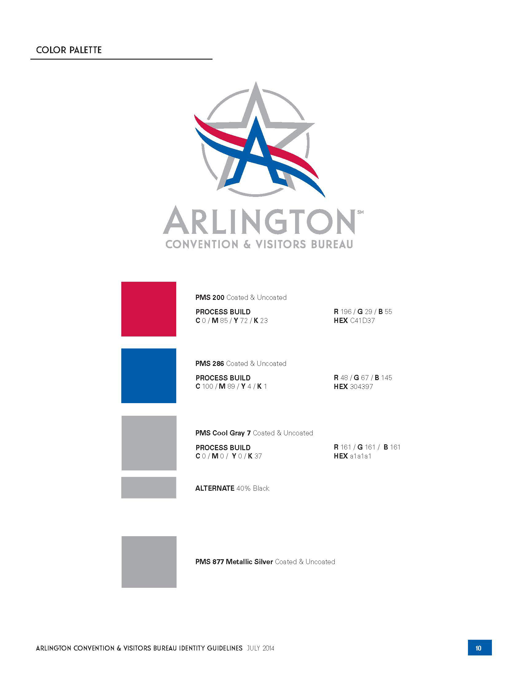
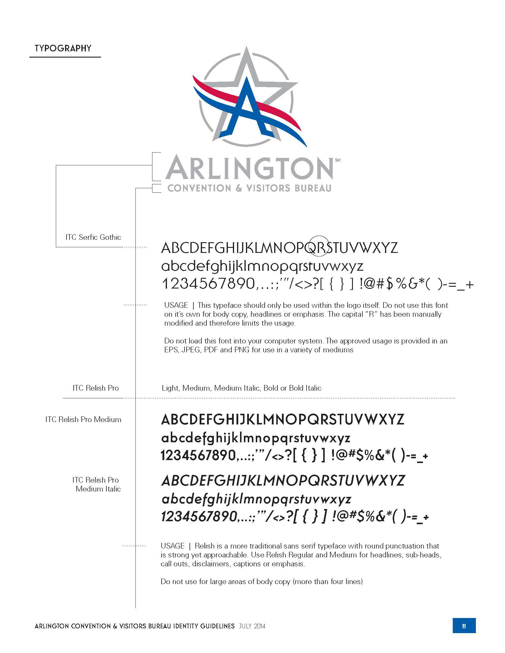
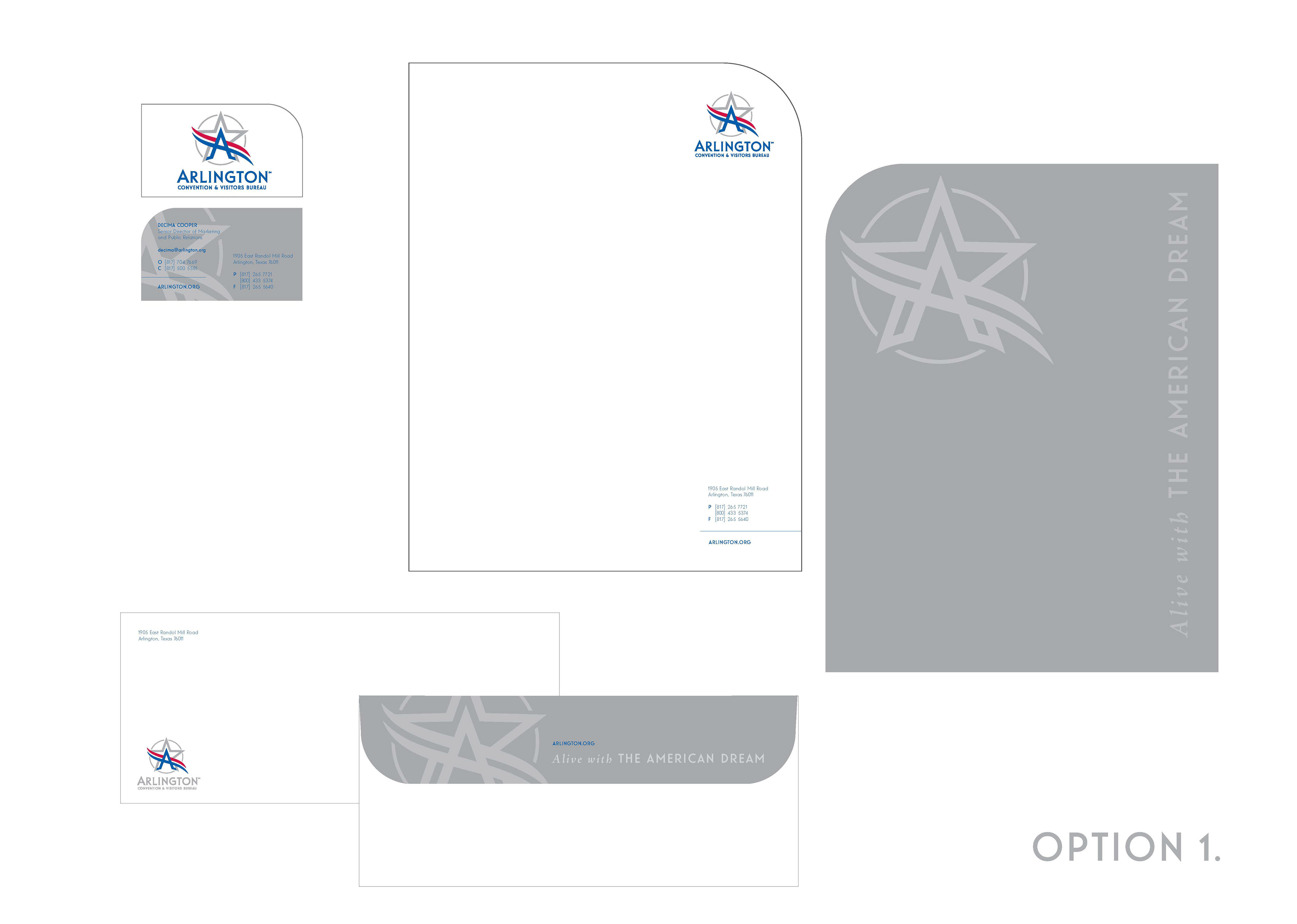
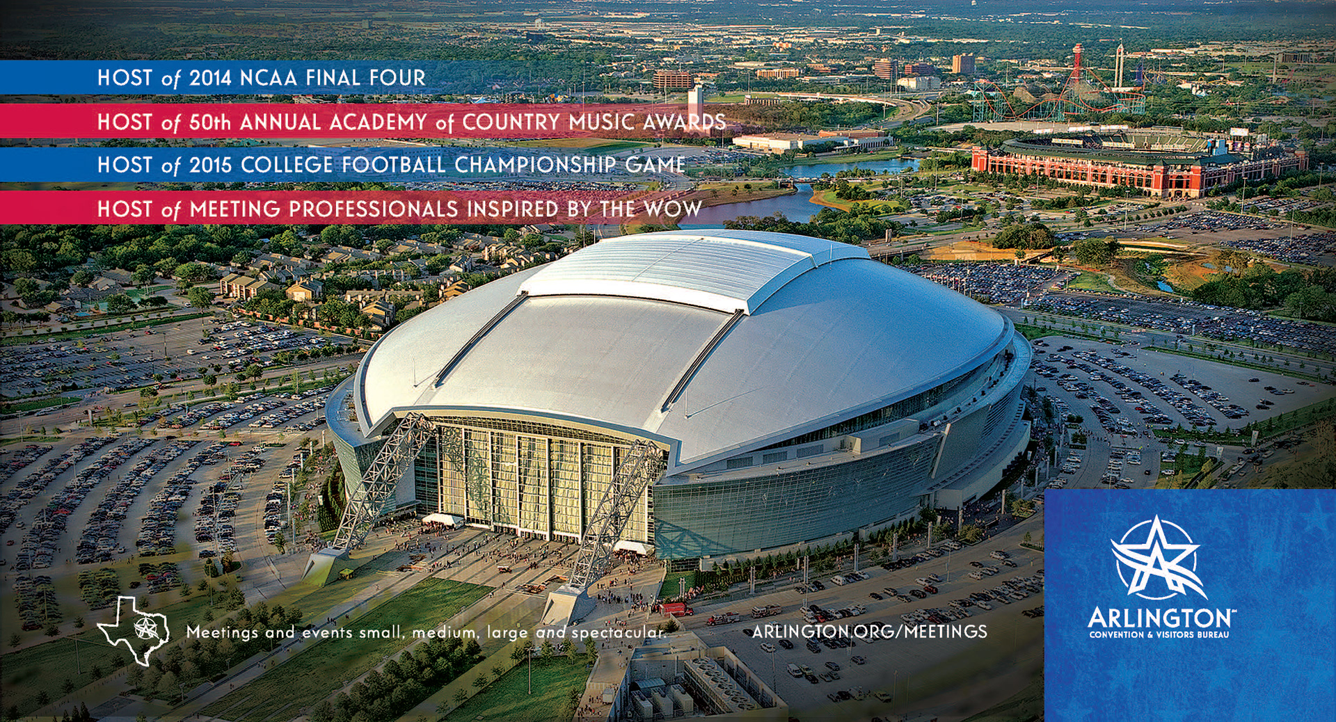
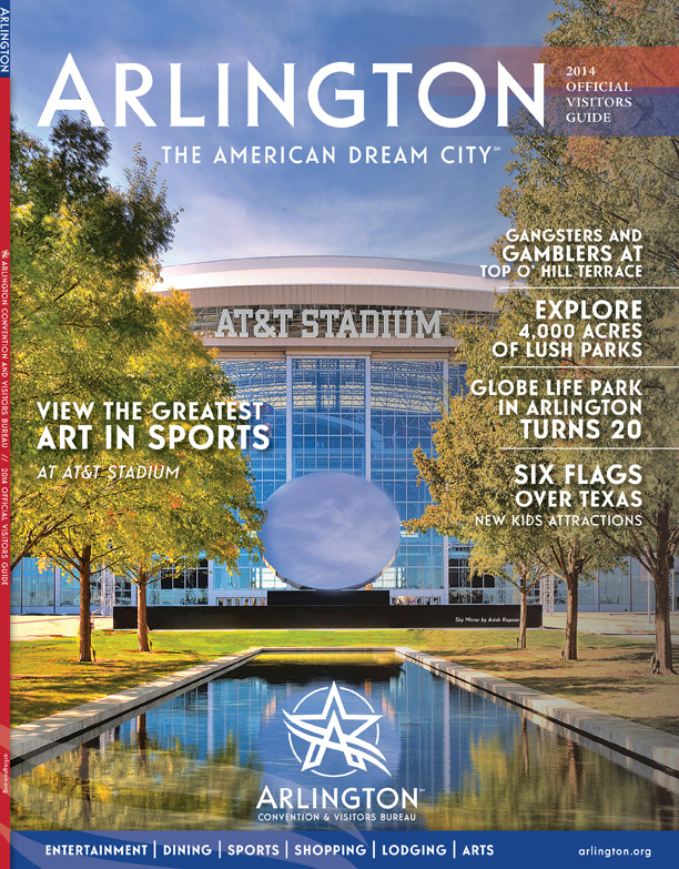
CLIENT | Arlington Convention and Visitors Bureau
The identity for the City of Arlington was so well received, that we were asked to develop a logo that would leverage the new Arlington brand, yet stand out as the CVB. I used the base of the City logo and created a ring around the "mark" that would embrace the "A" and therefore be the driving force for tourism and visitors to the City of Arlington, Texas. I designed an identity guide for the marketing team to use along with re-skinning the website to match the new look
The identity for the City of Arlington was so well received, that we were asked to develop a logo that would leverage the new Arlington brand, yet stand out as the CVB. I used the base of the City logo and created a ring around the "mark" that would embrace the "A" and therefore be the driving force for tourism and visitors to the City of Arlington, Texas. I designed an identity guide for the marketing team to use along with re-skinning the website to match the new look
PROJECTS COMPLETED Logo, Visual Guidelines, Business Package, Advertisments, Official Visitors Guide, Website Reskin
* Project completed while working with Jeff Miraglia, Mindset LLC.
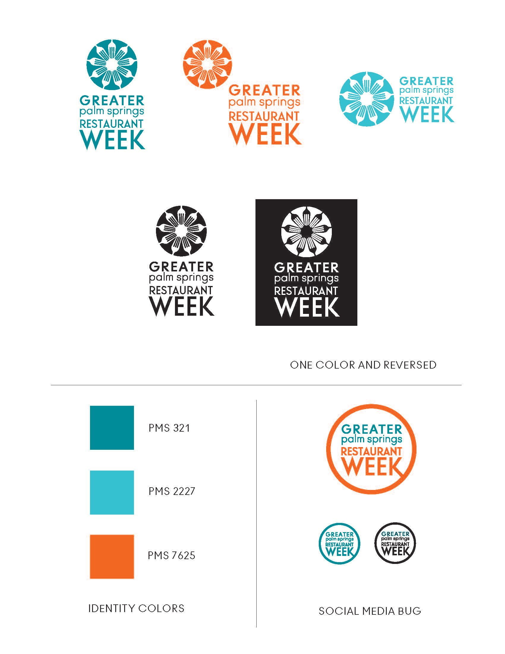
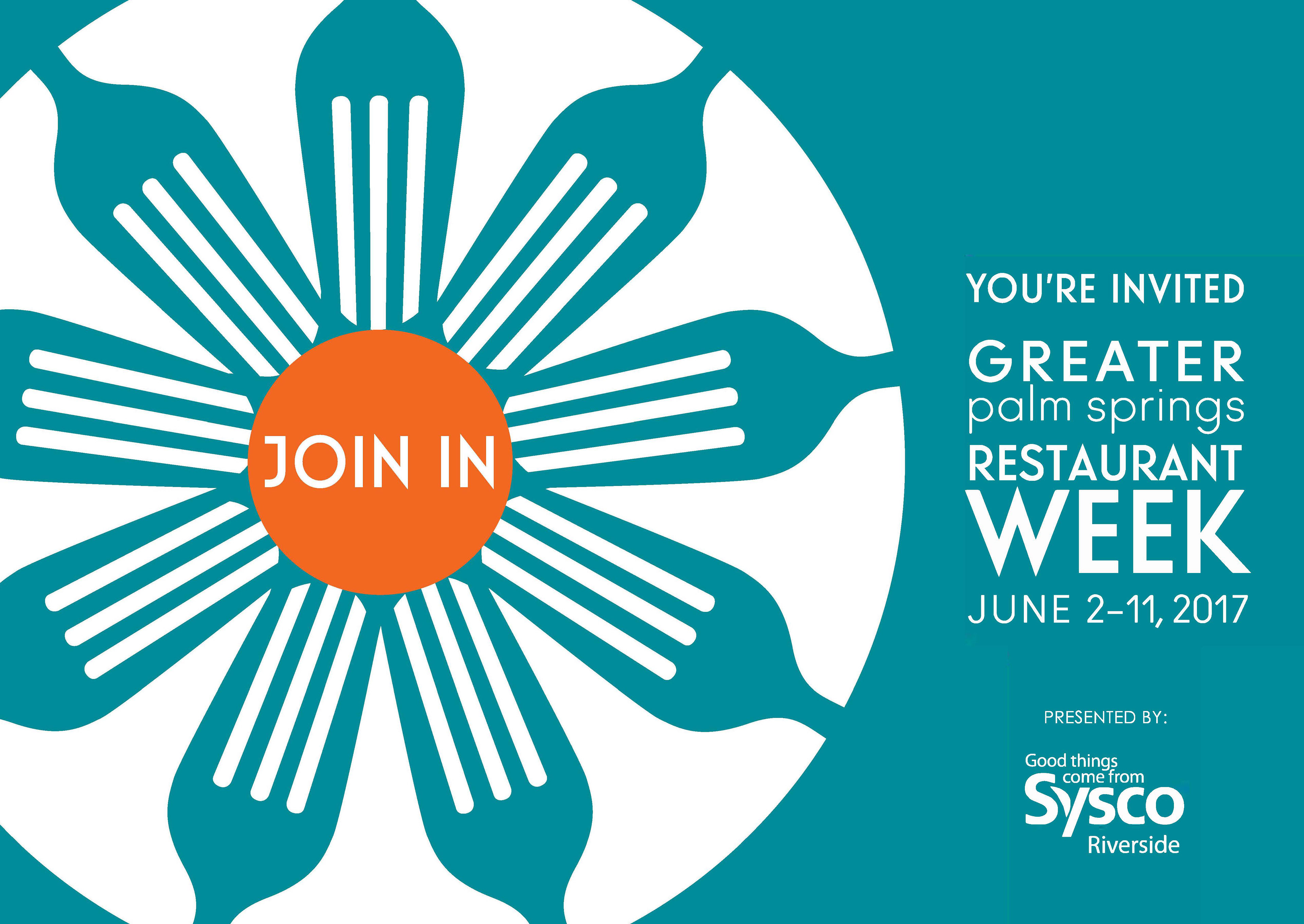
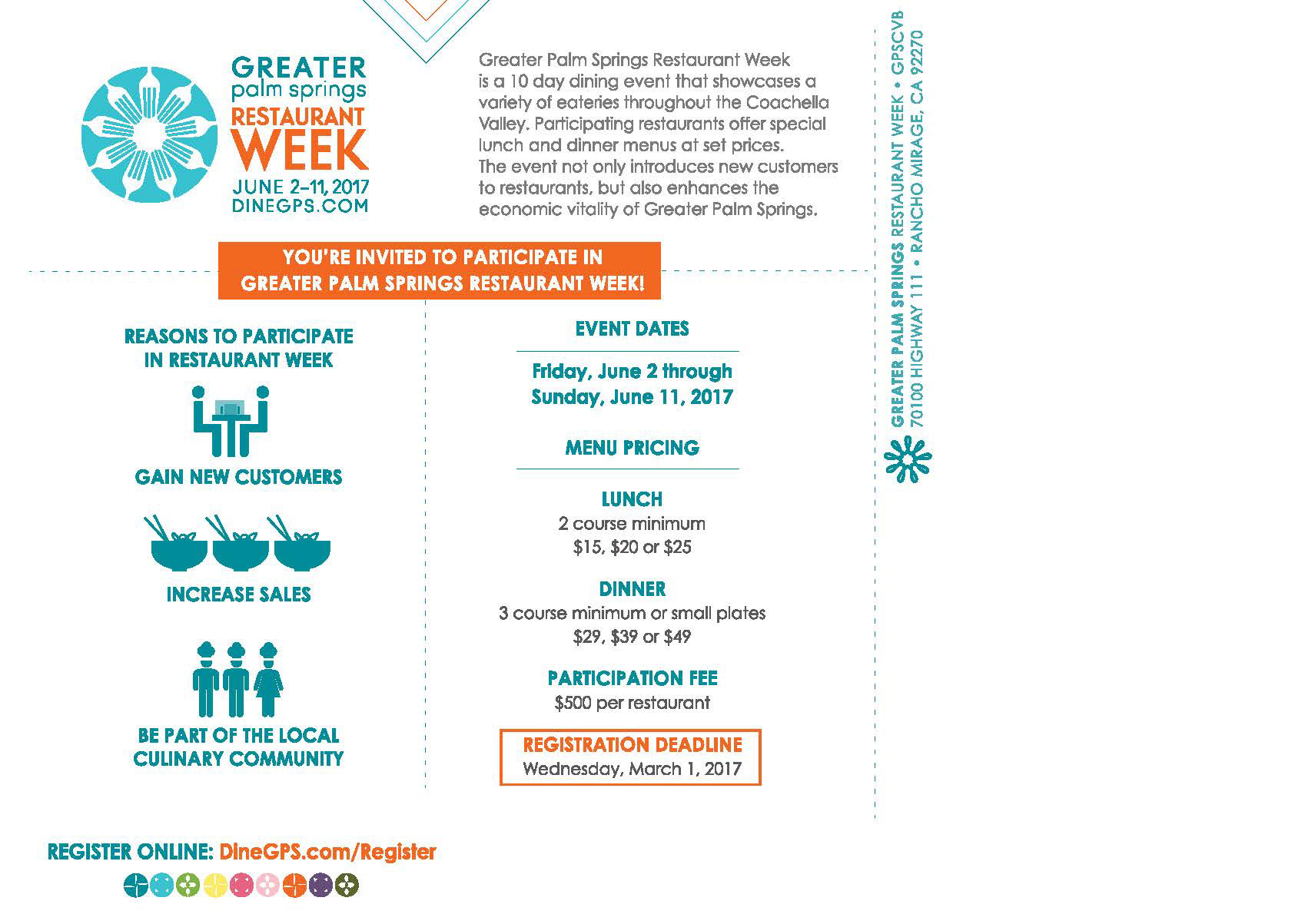
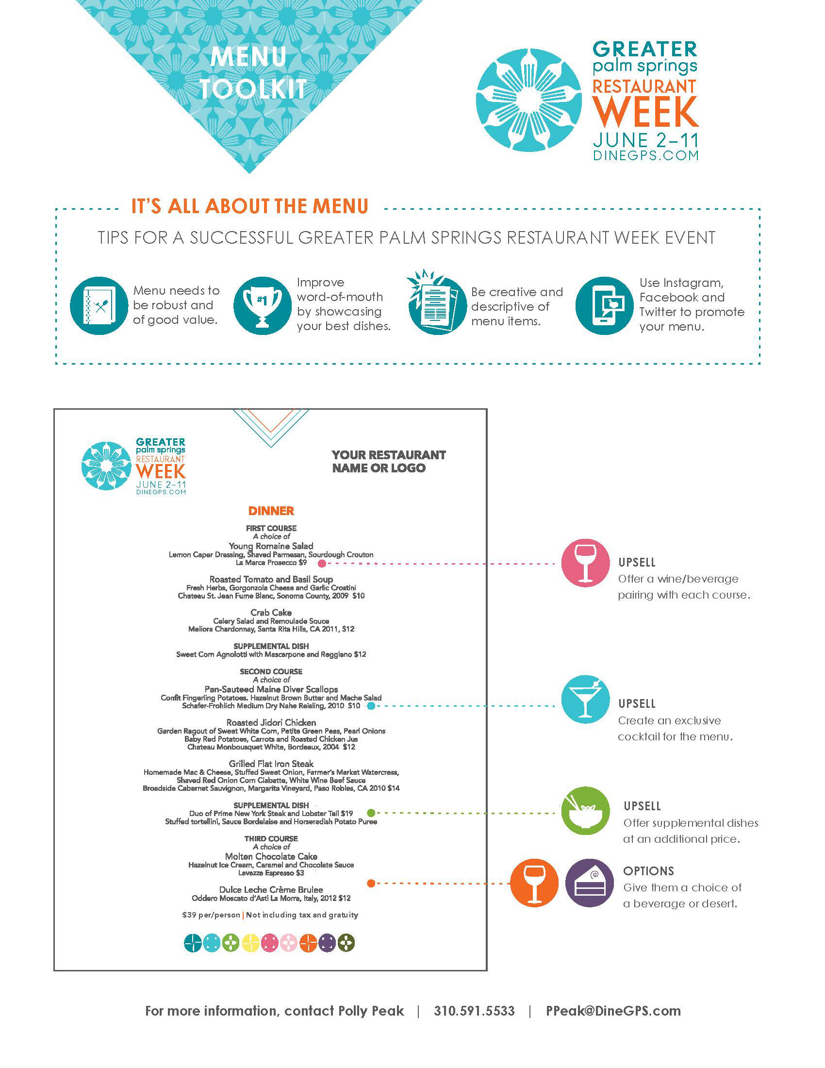
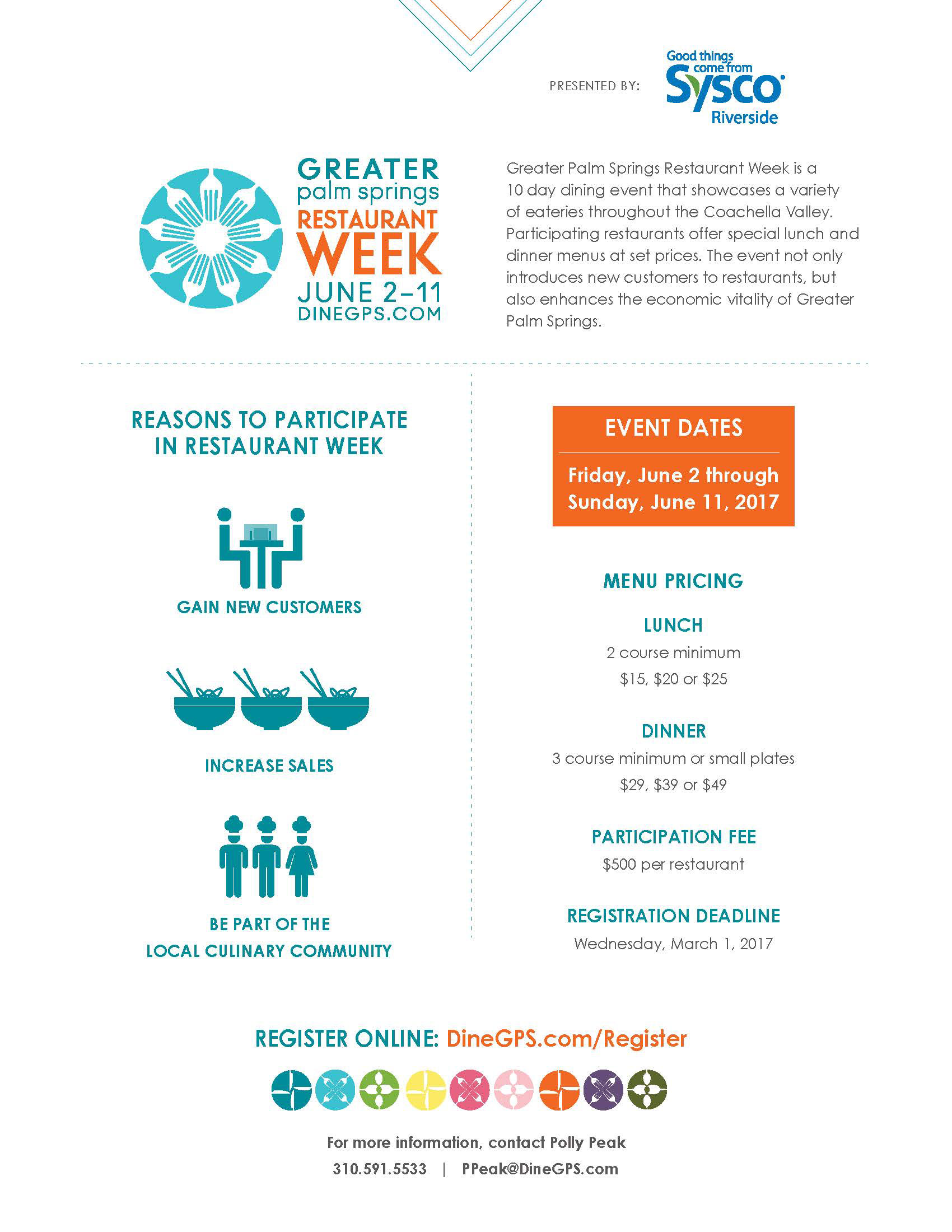
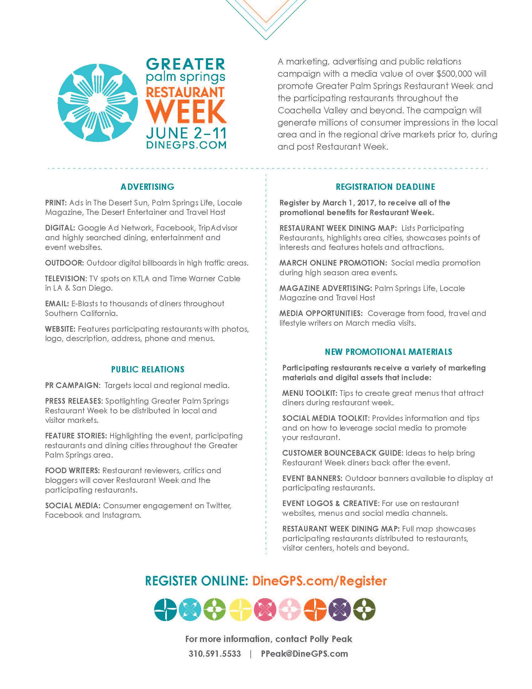
CLIENT | Greater Palm Springs Convention & Visitors Bureau (GPSCVB)
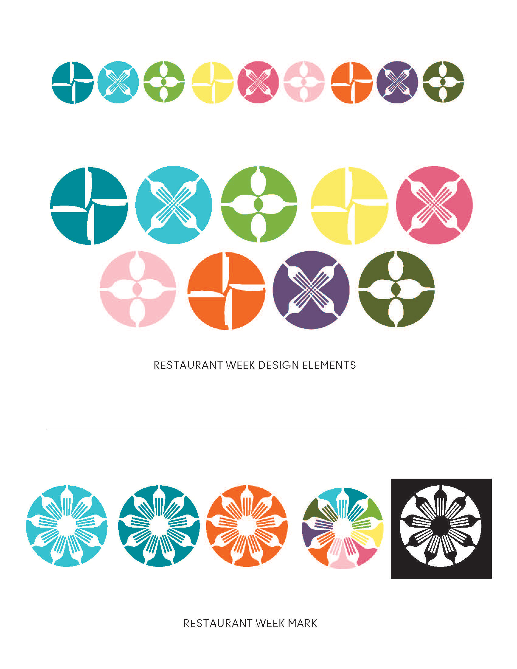
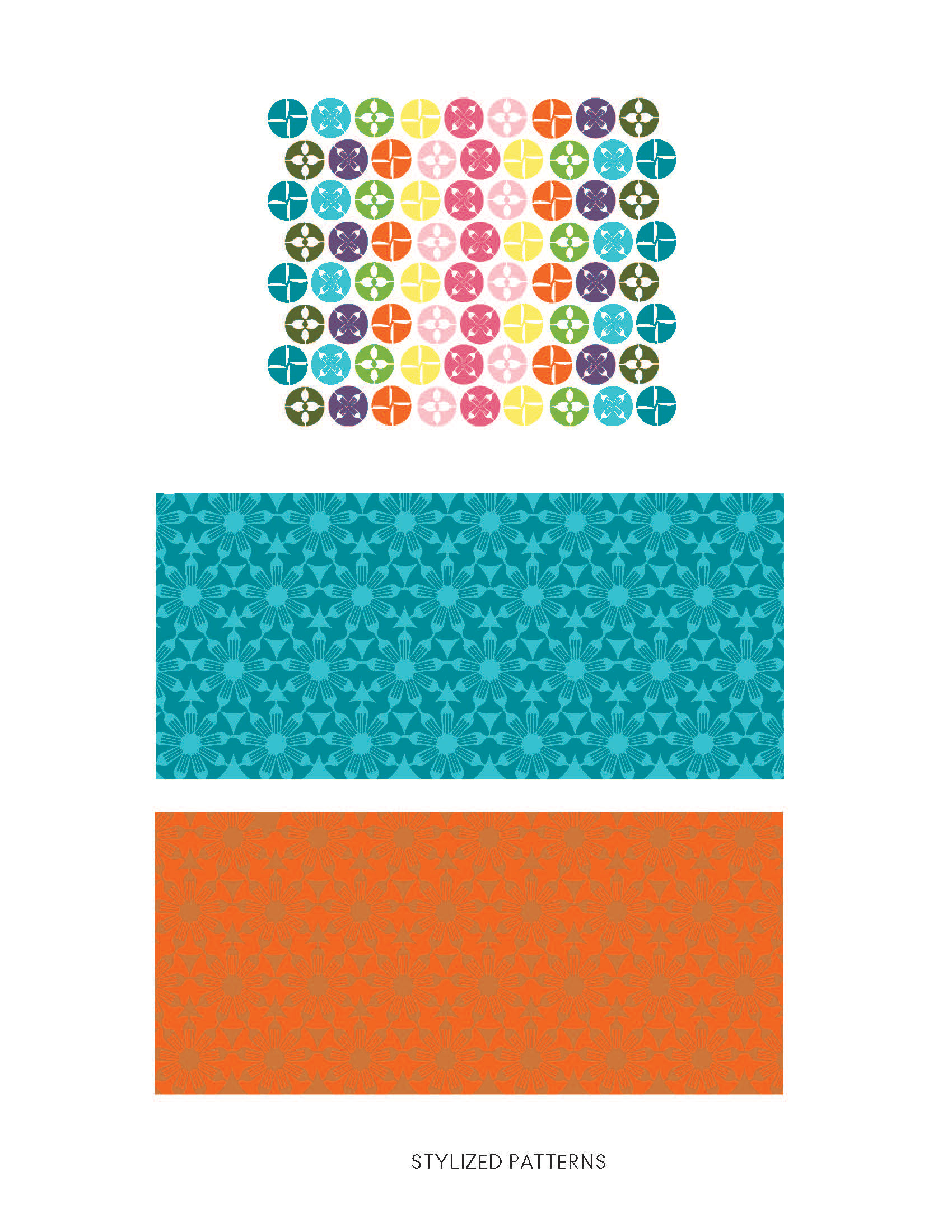
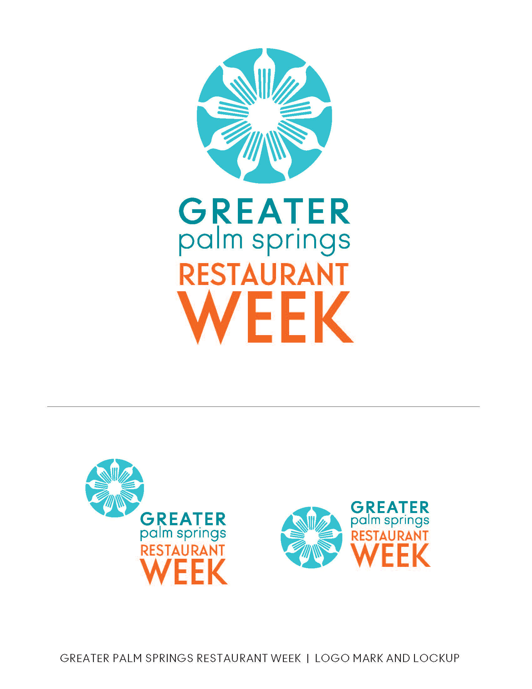
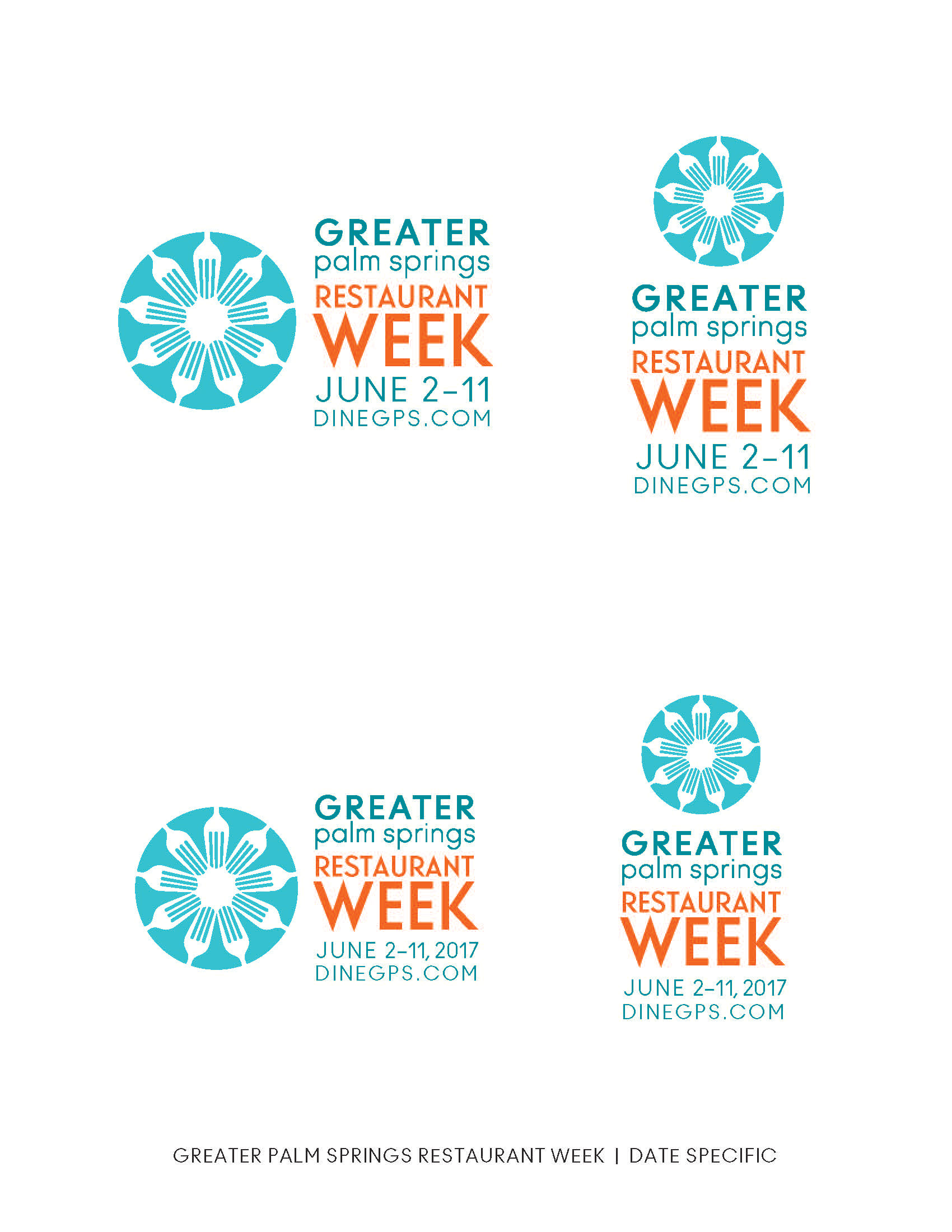
As the "foodie" segment grew, the need to market the amazing restaurants in the GPS nine cities did too. The GPSCVB is responsible for giving visitors and locals reasons to dine at new and local favorite places. I was asked to craft a identity to promote this annual event and keeping in line with the nine cities seemed important to use an iconic element - forks! The new brand took off and we developed a great new look and from there an awesome marketing campaign. See the PEACE. LOVE. EAT. campaign under the Advertising tab.
As the "foodie" segment grew, the need to market the amazing restaurants in the GPS nine cities did too. The GPSCVB is responsible for giving visitors and locals reasons to dine at new and local favorite places. I was asked to craft a identity to promote this annual event and keeping in line with the nine cities seemed important to use an iconic element - forks! The new brand took off and we developed a great new look and from there an awesome marketing campaign. See the PEACE. LOVE. EAT. campaign under the Advertising tab.
PROJECTS COMPLETED Logo, Visual Guidelines, Program tools (media kit), Postcard, Participation materials for restaurants.
_______________________________________________________________________
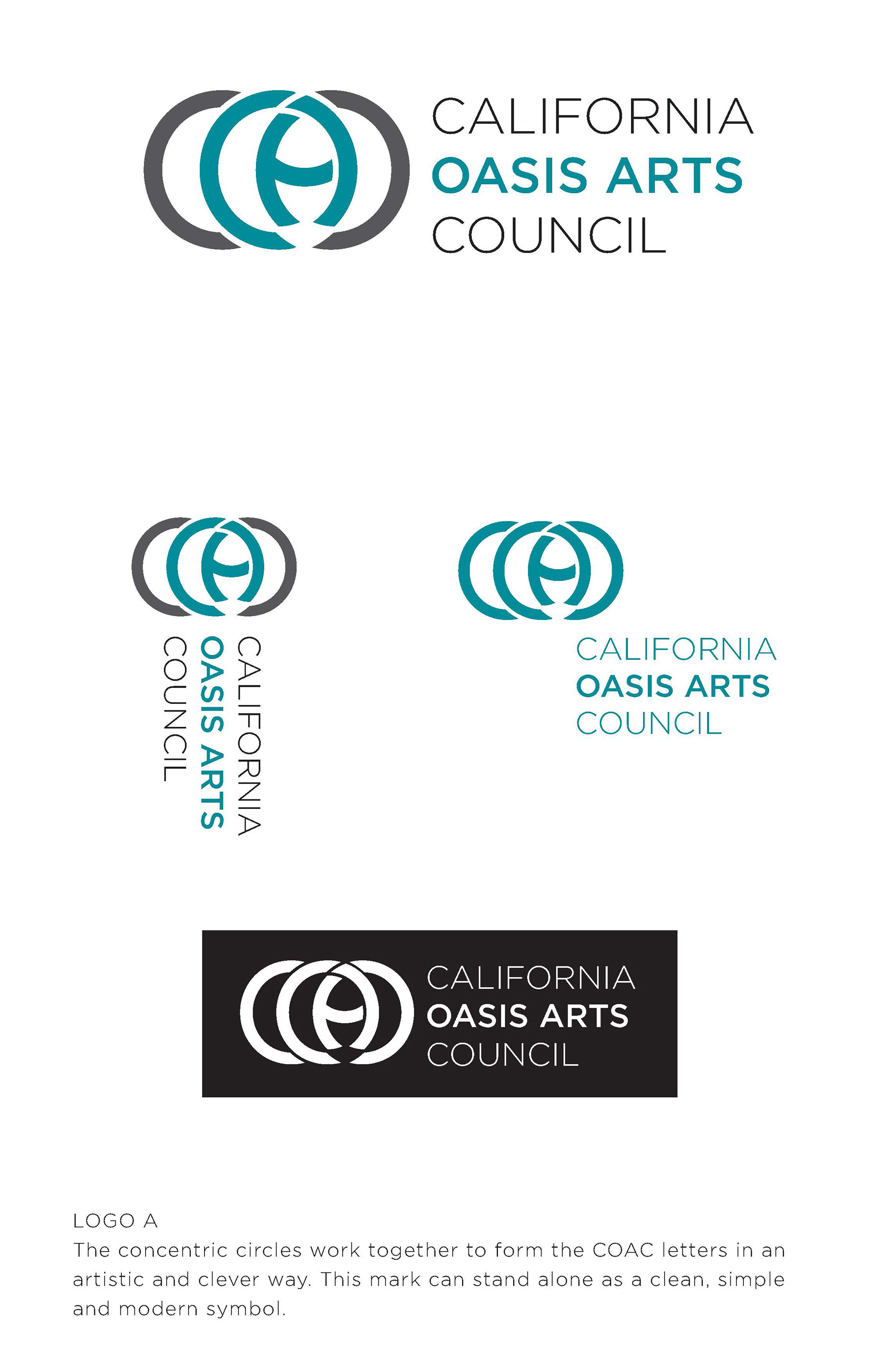
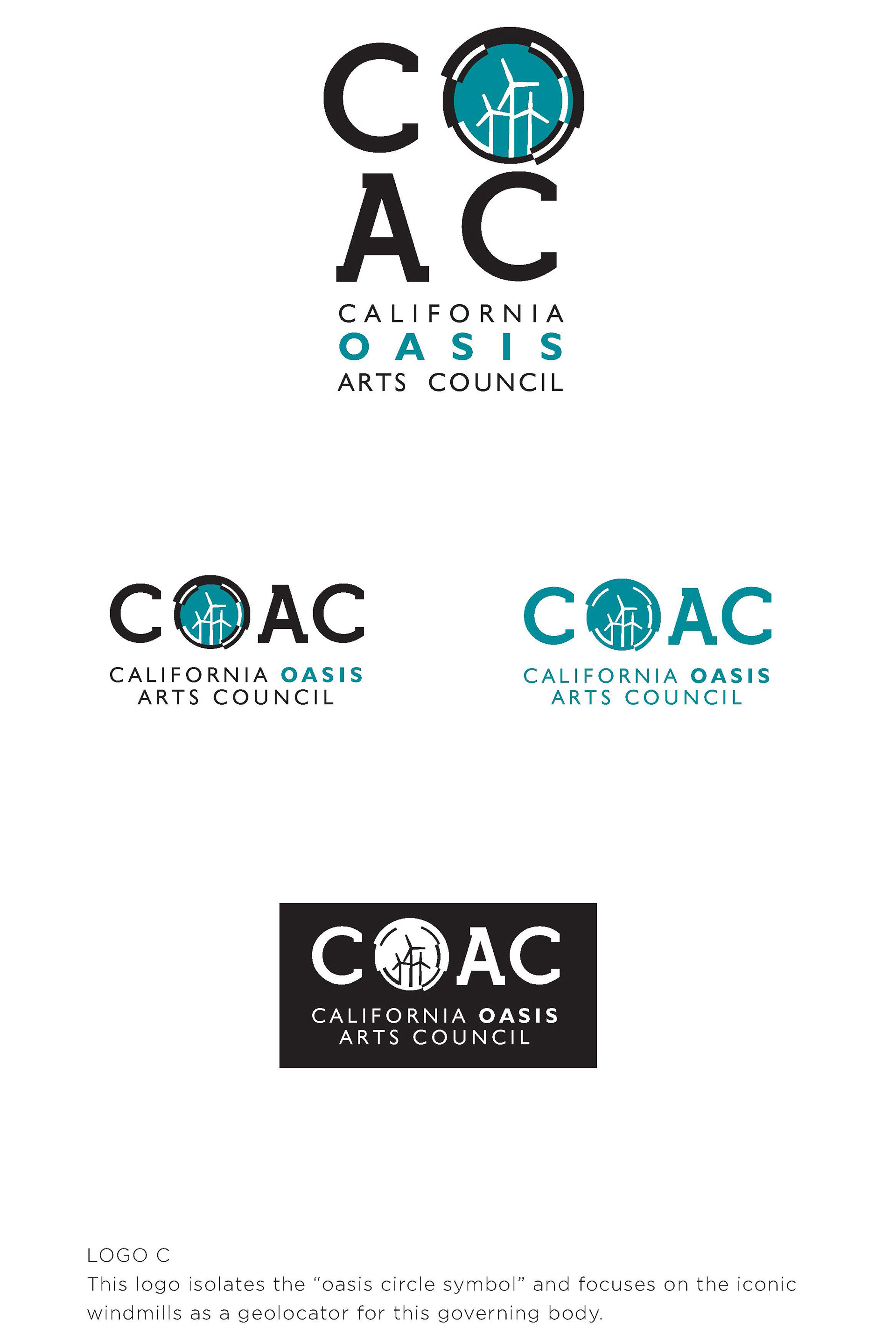
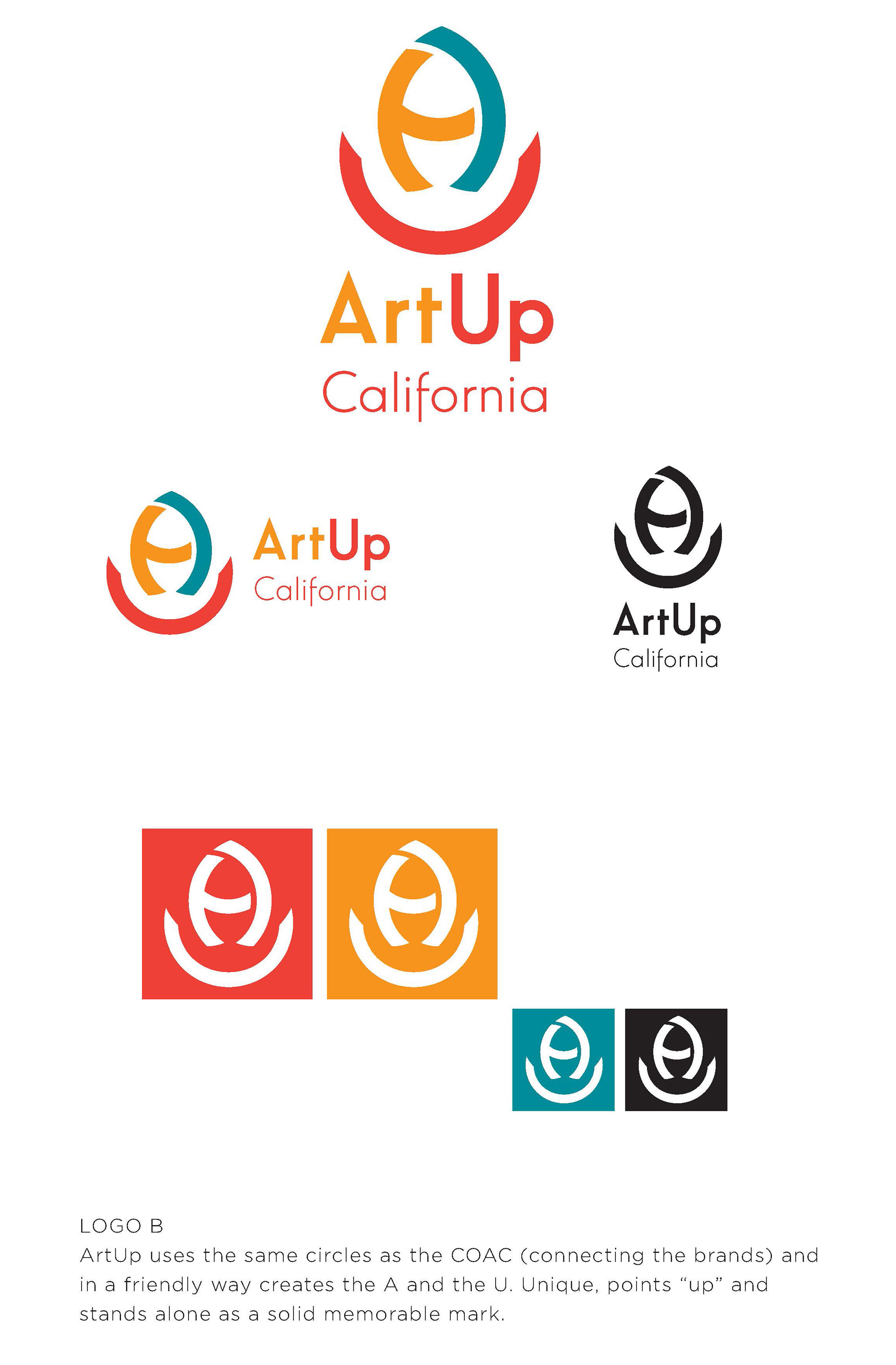
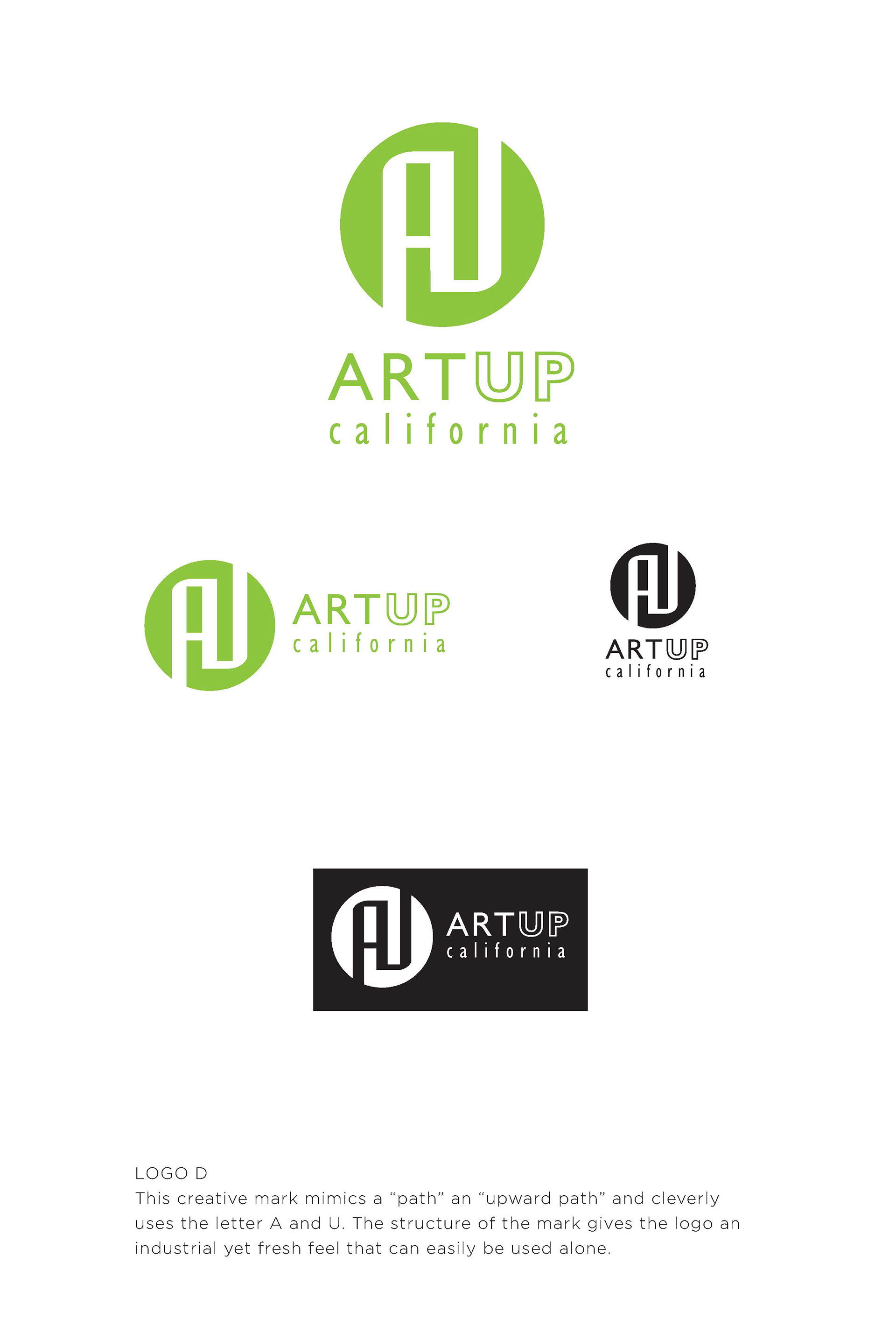
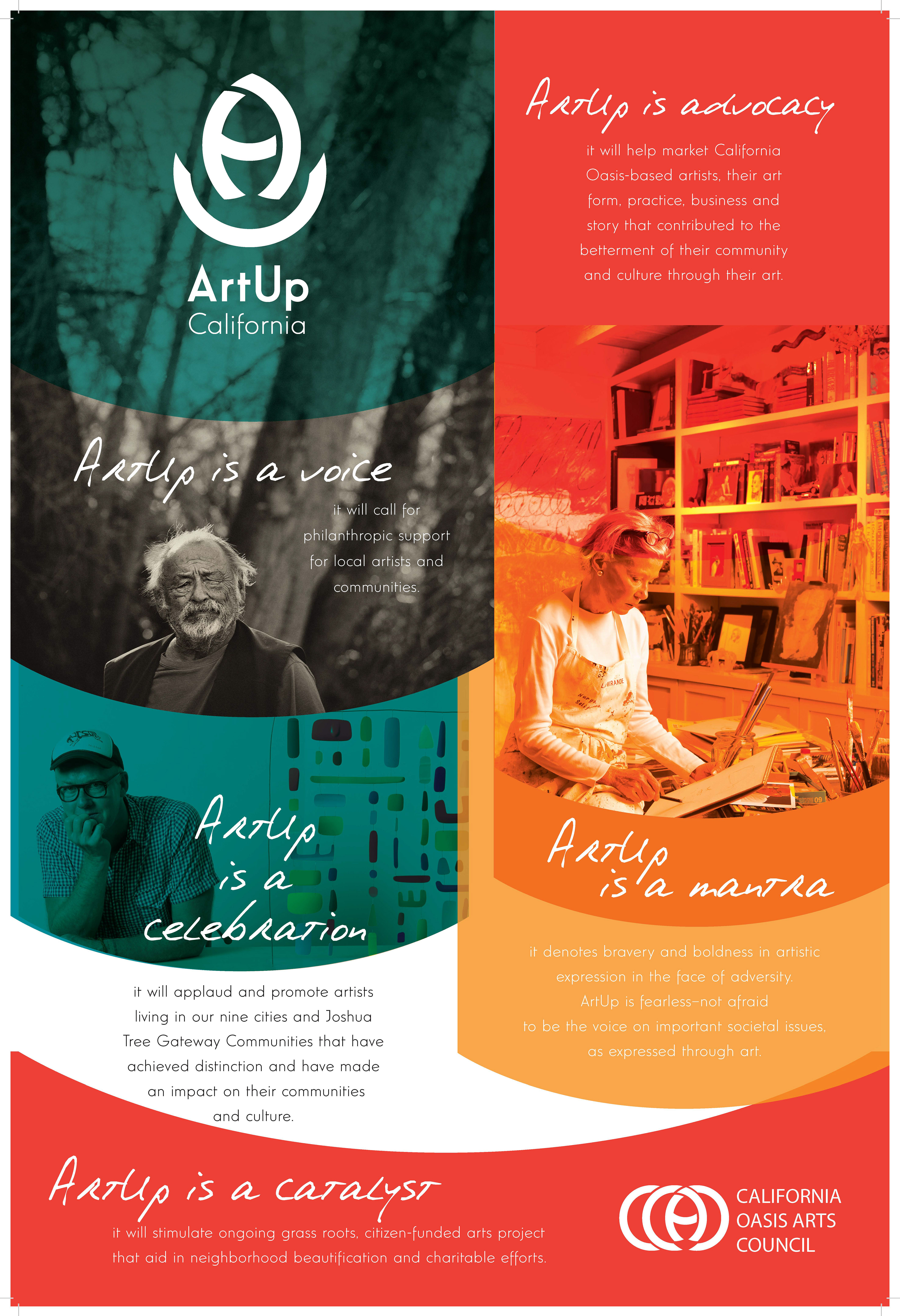
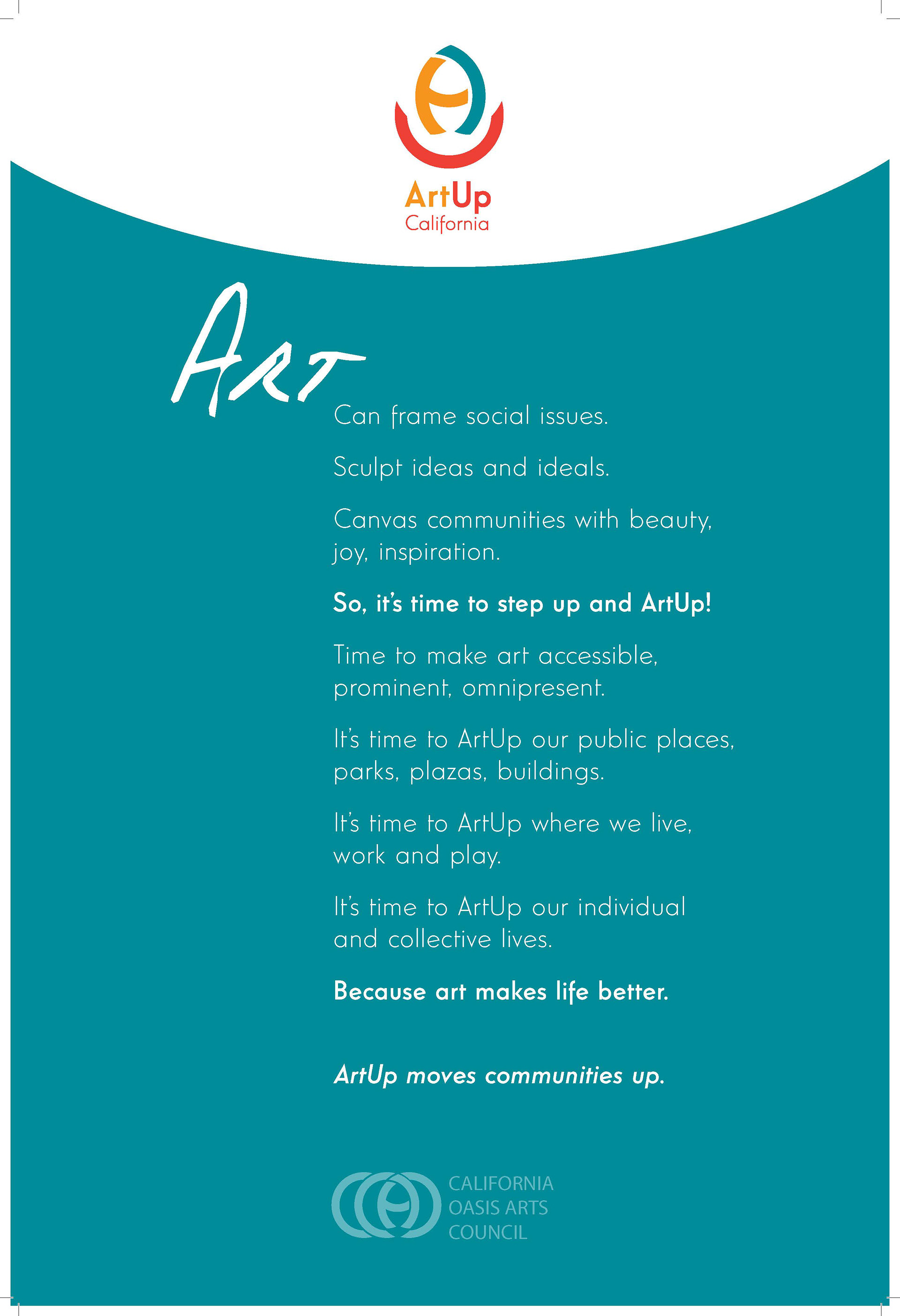
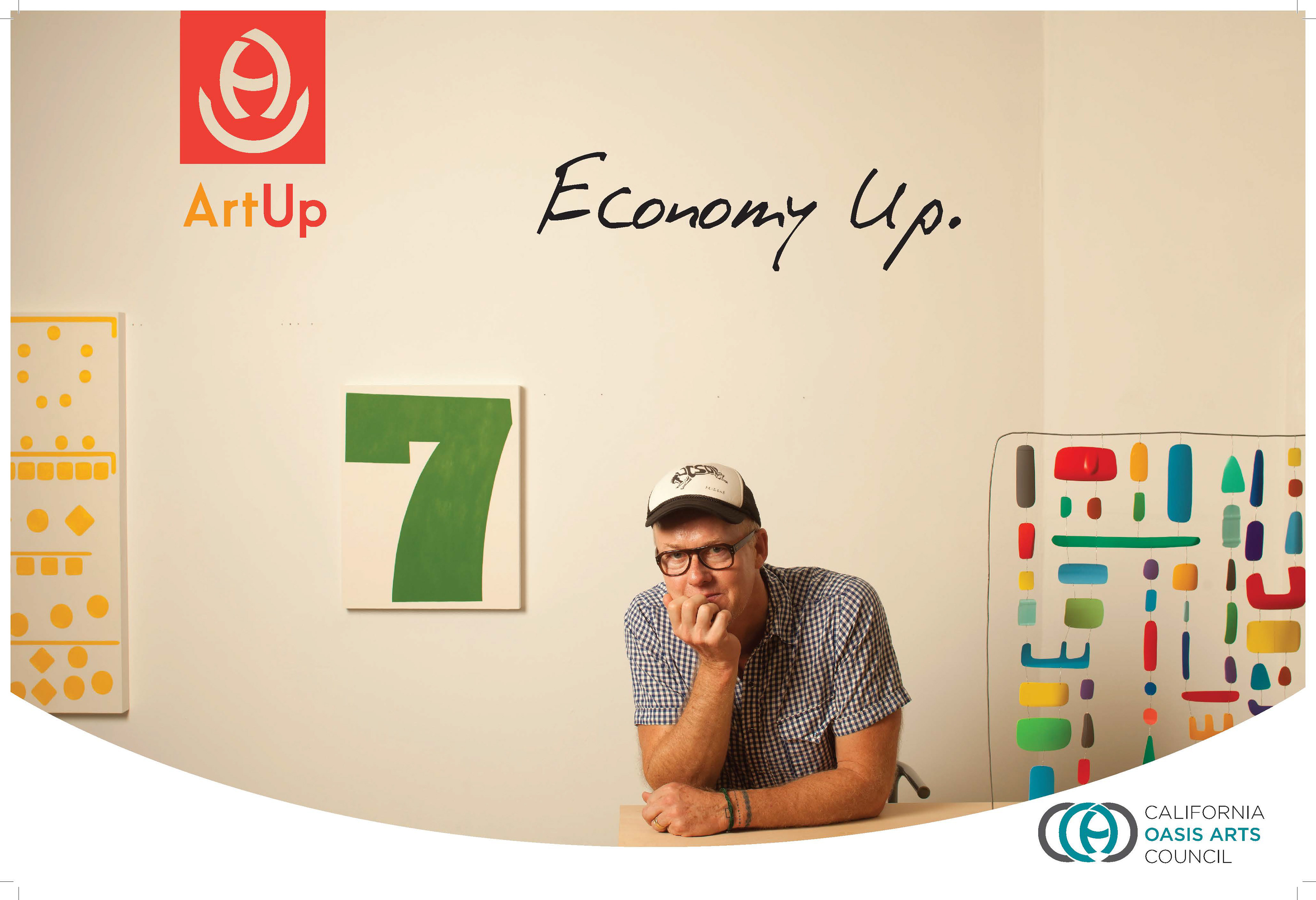
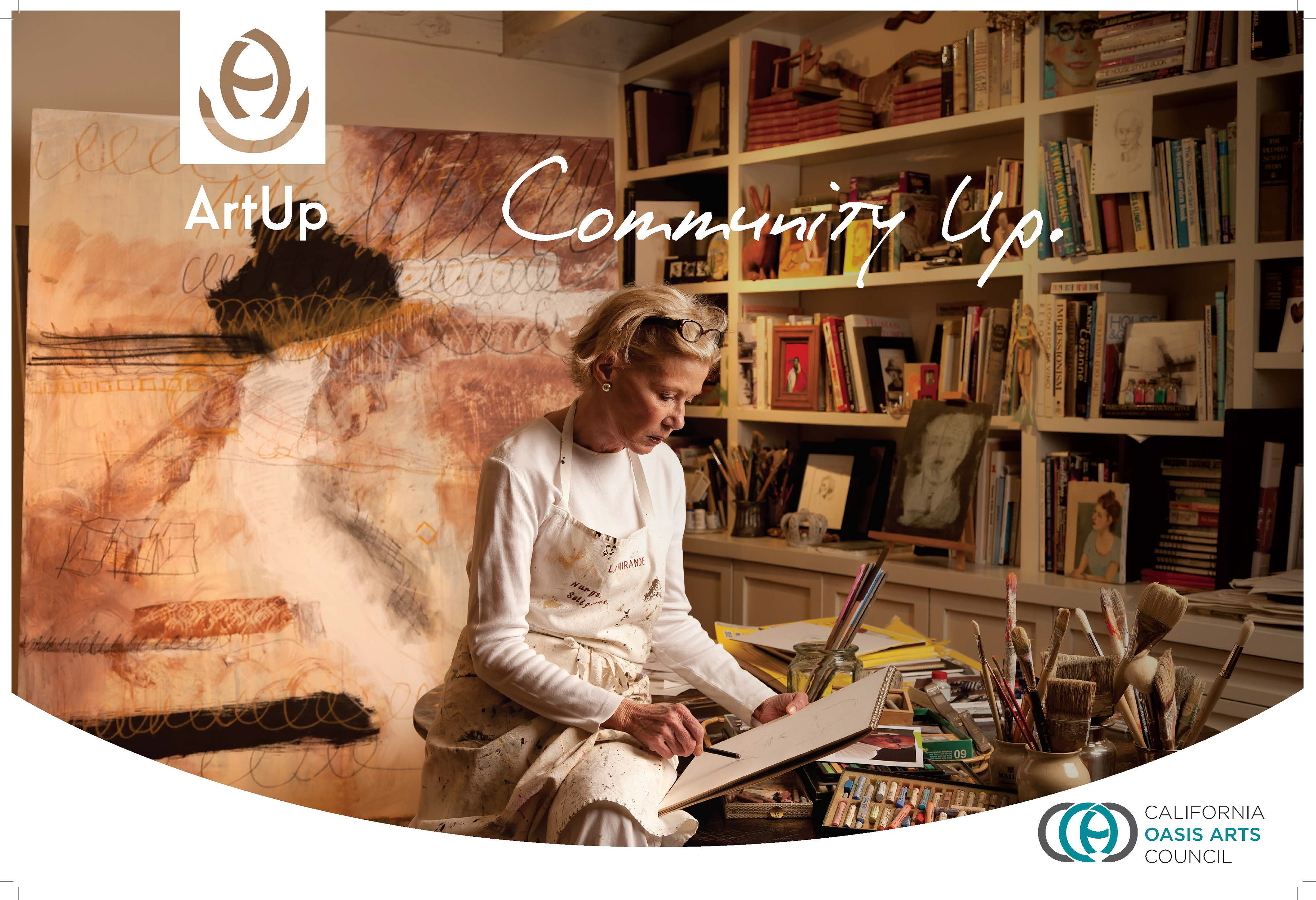
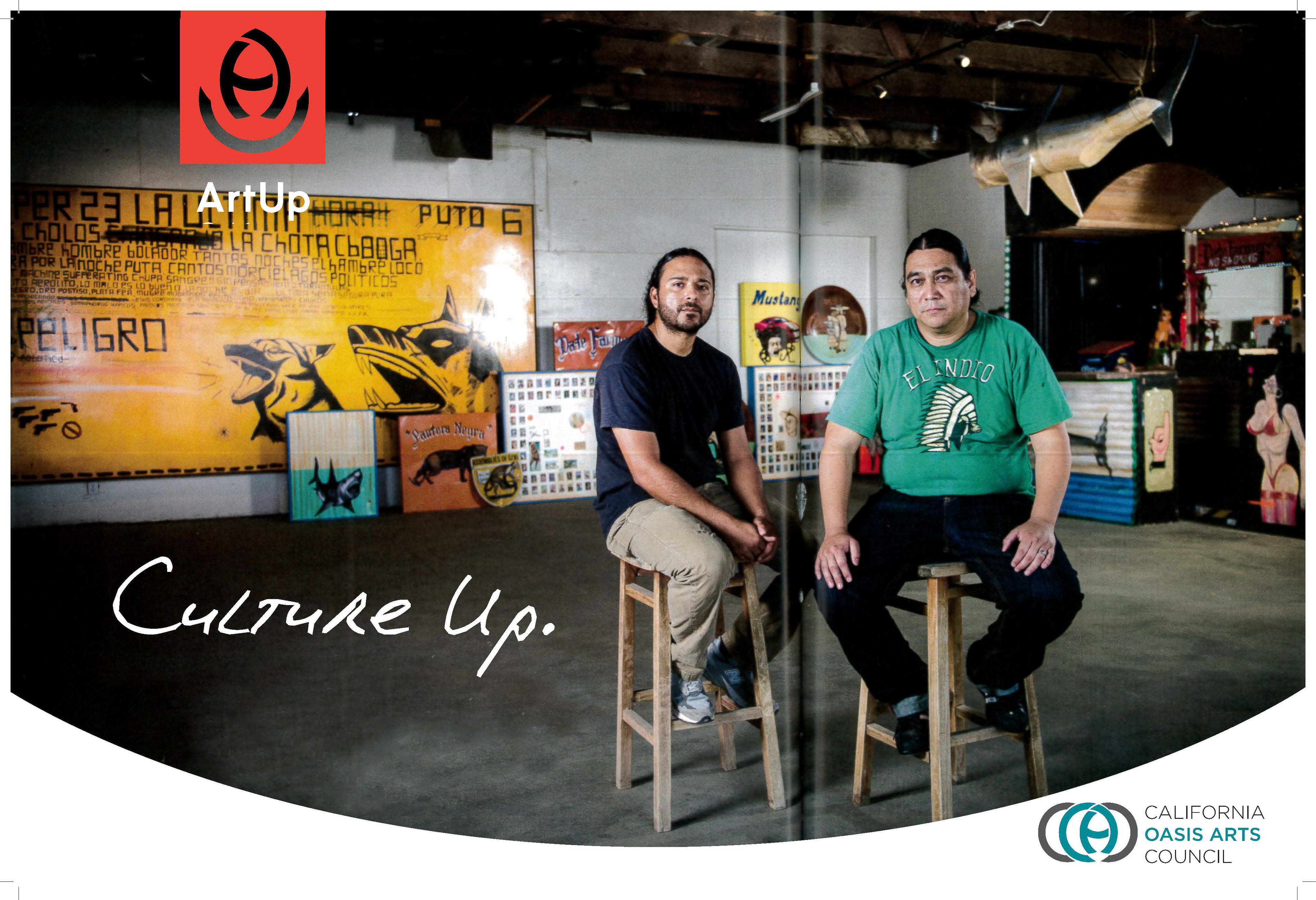
CLIENT | California Oasis Arts Council
I worked with the Creative Director to develop the identity for the COAC and at the same time develop an "arts initiative" and the identity for that. The two names COAC and ArtUP needed to work together. I presented two ideas for each and rationale. Along with the identity I proposed a visual look for the brand.
I worked with the Creative Director to develop the identity for the COAC and at the same time develop an "arts initiative" and the identity for that. The two names COAC and ArtUP needed to work together. I presented two ideas for each and rationale. Along with the identity I proposed a visual look for the brand.
PROJECTS COMPLETED Logo Designed for parent company and art initiative, marketing communications/designs for ArtUp.
______________________________________________________________________________________________________________
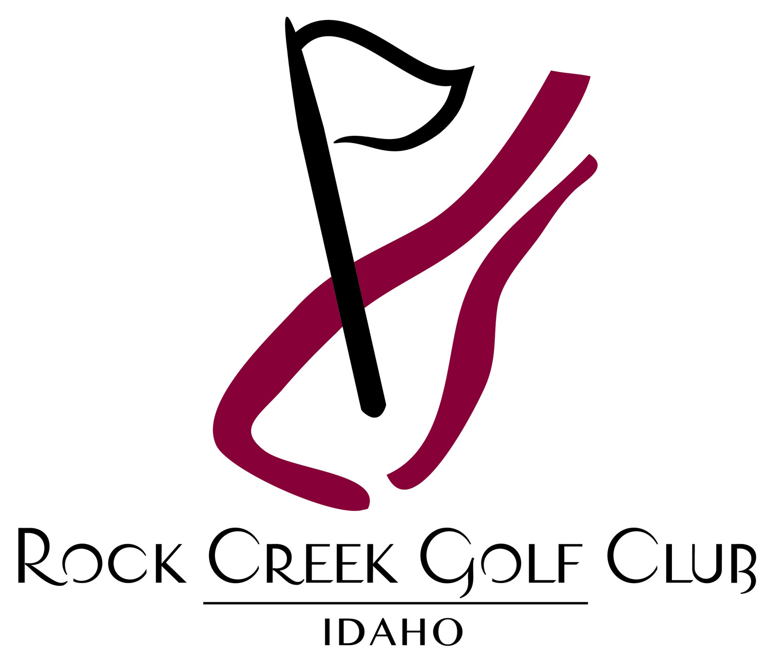
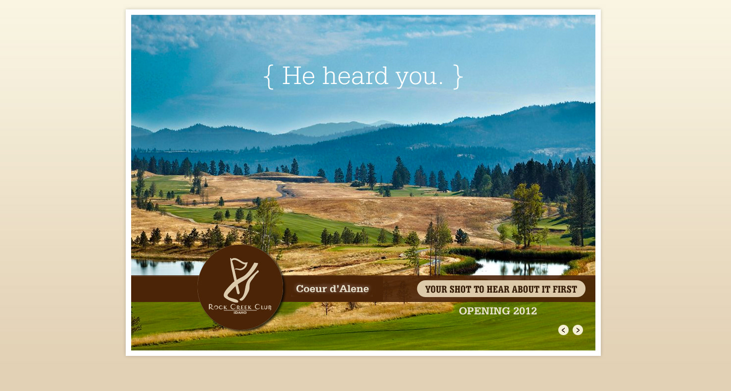
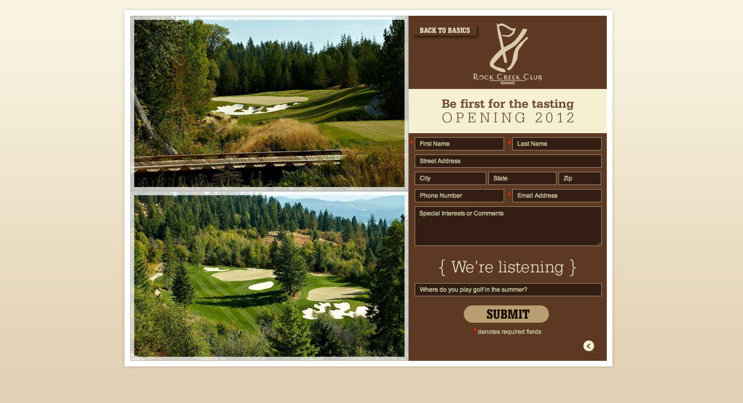
CLIENT | Rock Creek Golf Club, Couer d'Alene, Idaho
Developed a simple logo for a unique club that beautifully blended the golf and wine lifestyle for a Golf Resort community in Idaho. I also designed the website splash introduction.
PROJECTS COMPLETED Logo Designed, Splash page web page
* Project completed while working for Martz Agency, Scottsdale, Arizona
___________________________________________________________________________________________________
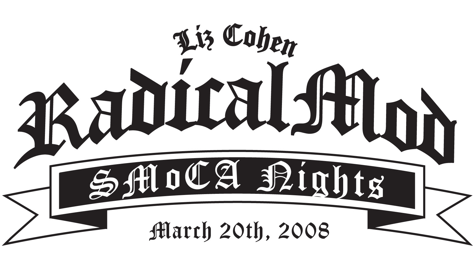
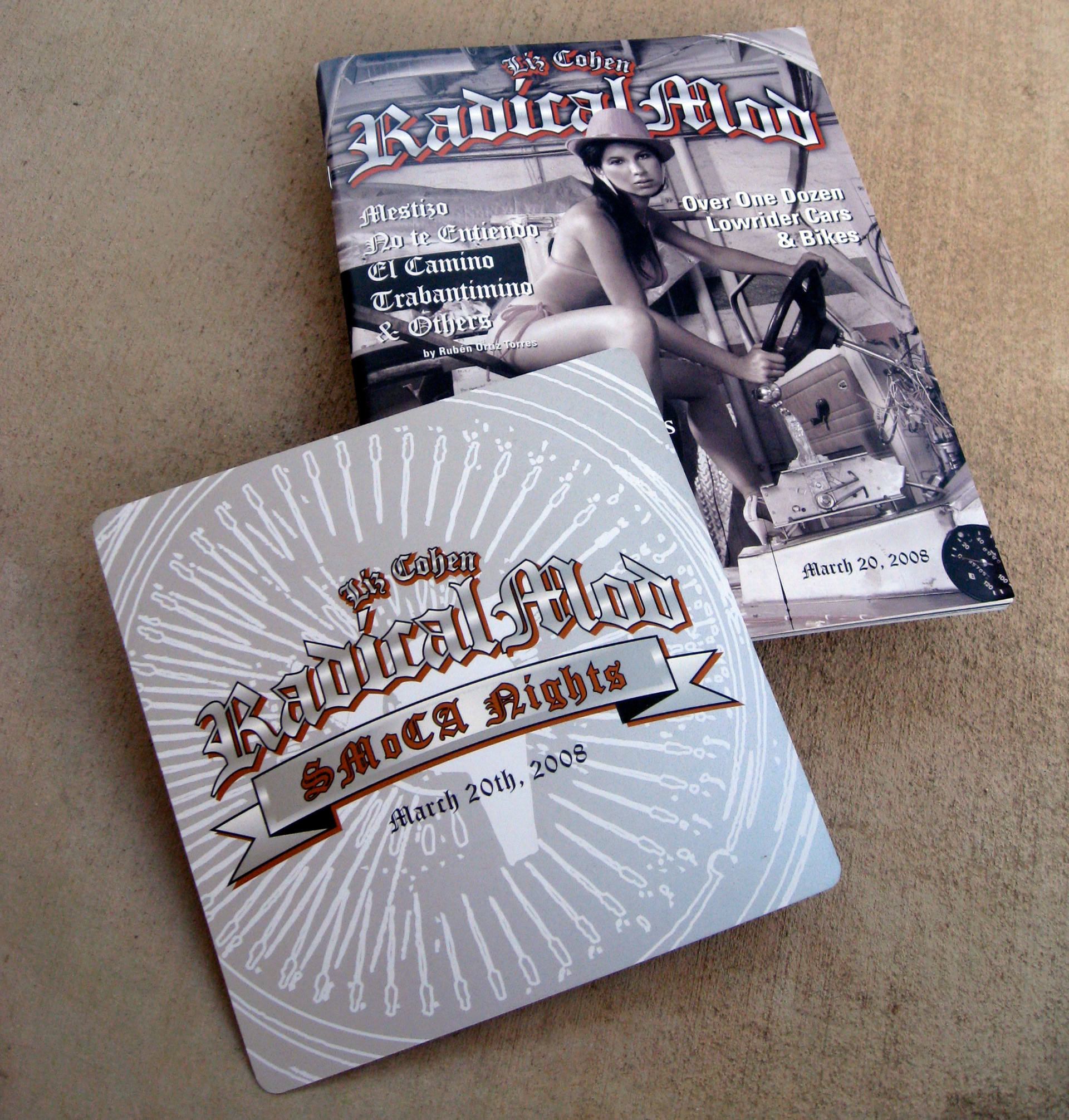
CLIENT | Scottsdale Museum of Contemporary Art and Scottsdale Public Art
Created a logo for an upcoming exhibition opening to promote artist Liz Cohen's art exhibition "Radical Mod". The exhibition and event showcased lowrider cars and bicycles and the artists who designed them. The above invitation was printed with metallic ink, T-shirts were made and I also designed a publication for the exhibition in SMoCA of Liz Cohen's transformed a German Trabant into a showy lowrider.
PROJECTS COMPLETED Logo, Invitation Card, T-shirt, Exhibition Graphics, Magazine-style Program documenting the public art event and the low-riders showcased.
* Project completed while working as an in-house designer for SMOCA and Scottsdale Public Art
* Project completed while working as an in-house designer for SMOCA and Scottsdale Public Art
__________________________________________________________________________________________________
CLIENT | GREATER PALM SPRINGS CONVENTION & VISITORS BUREAU
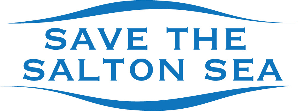
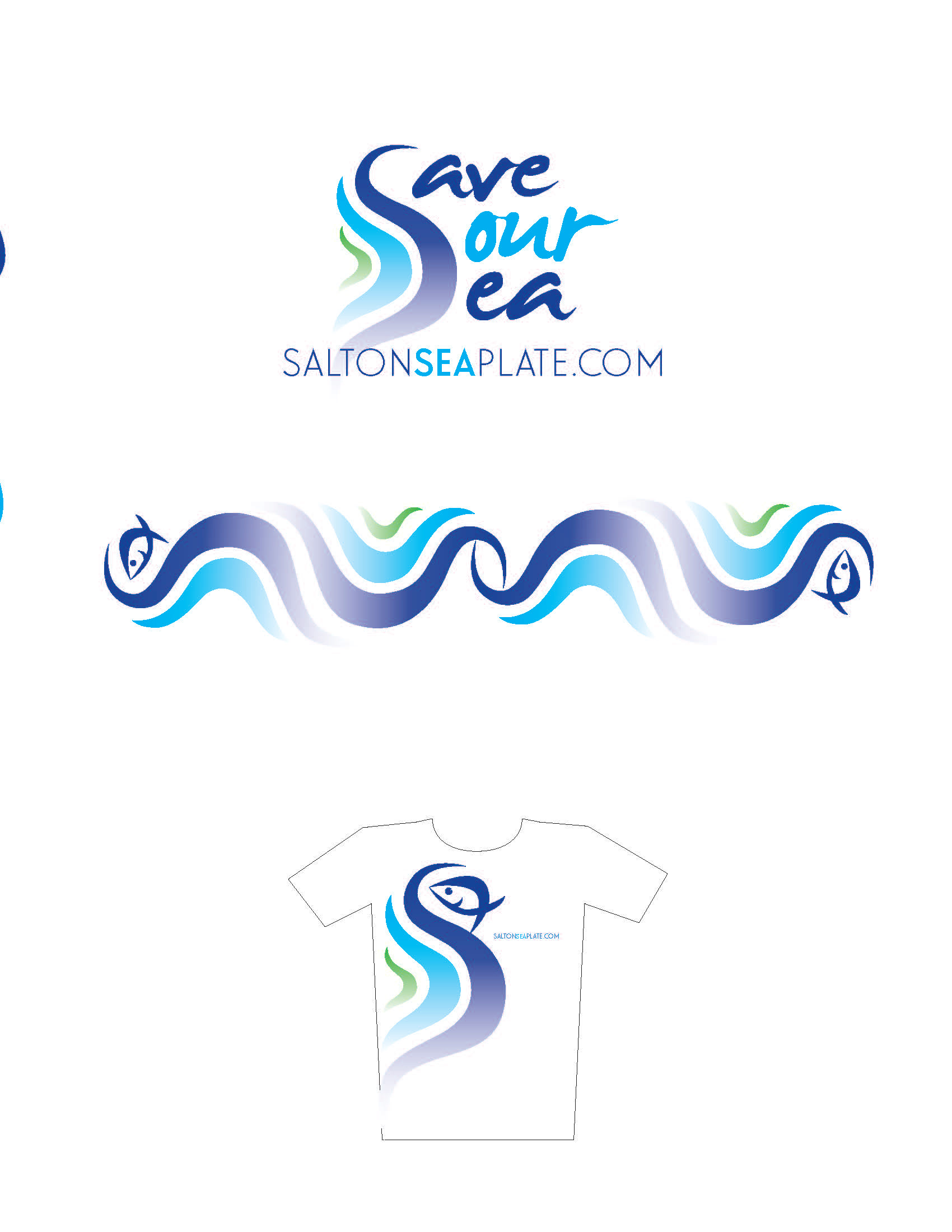
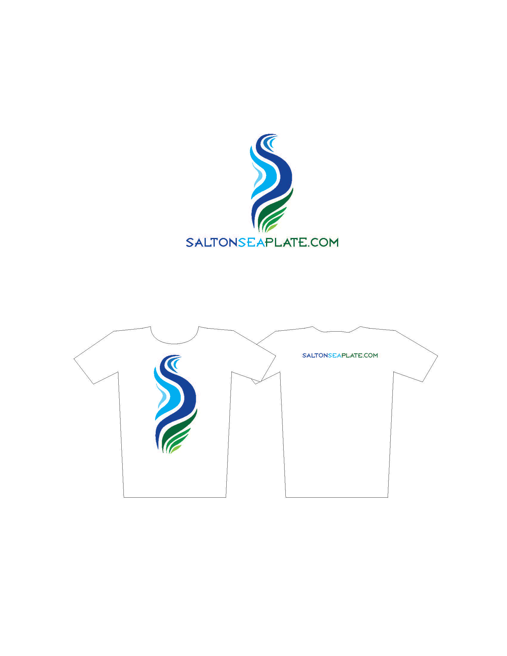
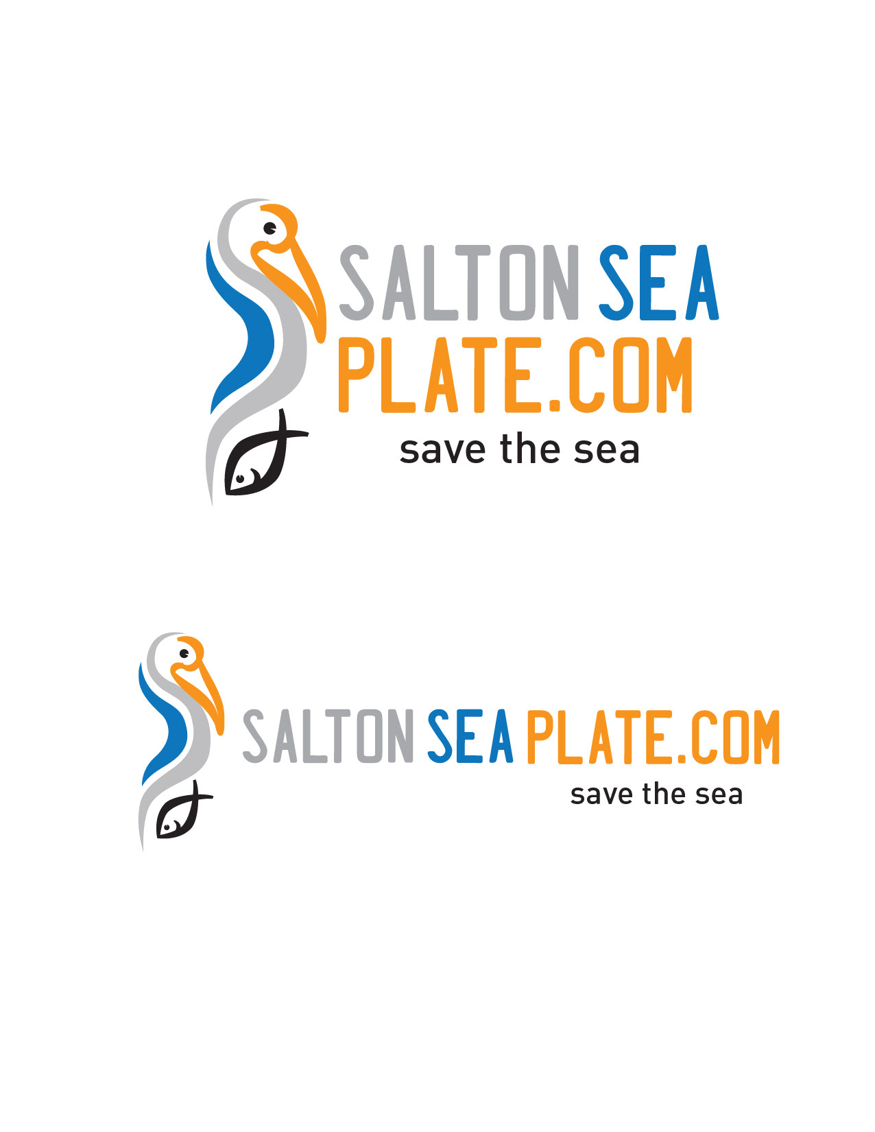
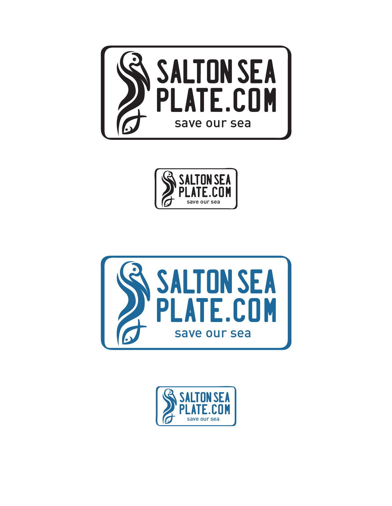
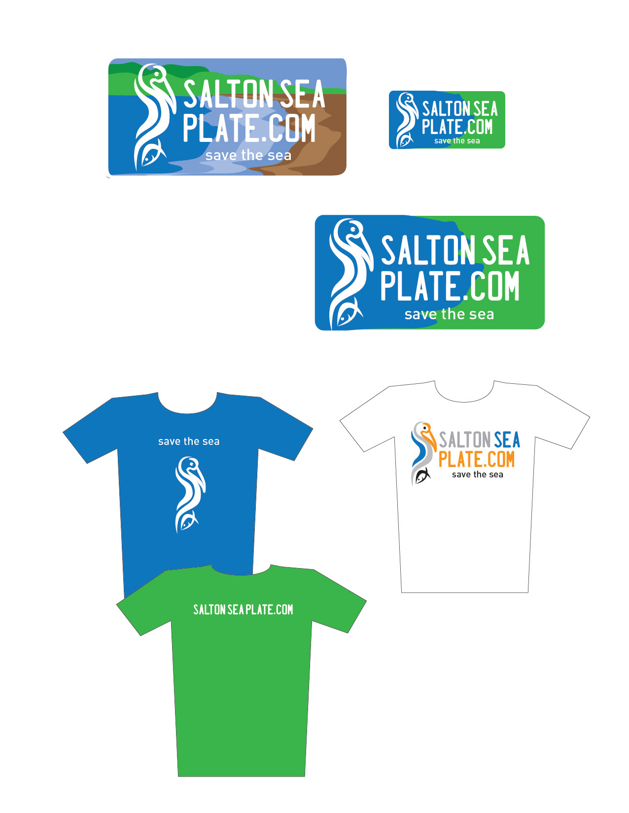
As part of an initiative to save the Salton Sea, the GPSCVB has been instrumental in bringing awareness to the impact of this wildlife and tourism destination. The above logo was developed to bring awareness and is used on an information page for the CVB. Also, there was a drive to develop a campaign and design for a plate for the Salton Sea. The plate would raise much needed funds for it's survival. The logos above were used to show media, tourism partners and decision makers in Riverside County and the state of California.
_________________________________________________________________________________________________
CLIENT | GREATER PALM SPRINGS CONVENTION & VISITORS BUREAU
This symbol was developed to represent the growth, vibrancy and connectivity that the CDAC will bring to the nine Greater Palm Springs cities. The use of an artistic mandala with intertwining arches create a union. The CDAC is the union that provides momentum for the cultural expansion of art in the Coachella Valley.
__________________________________________________________________________________________________
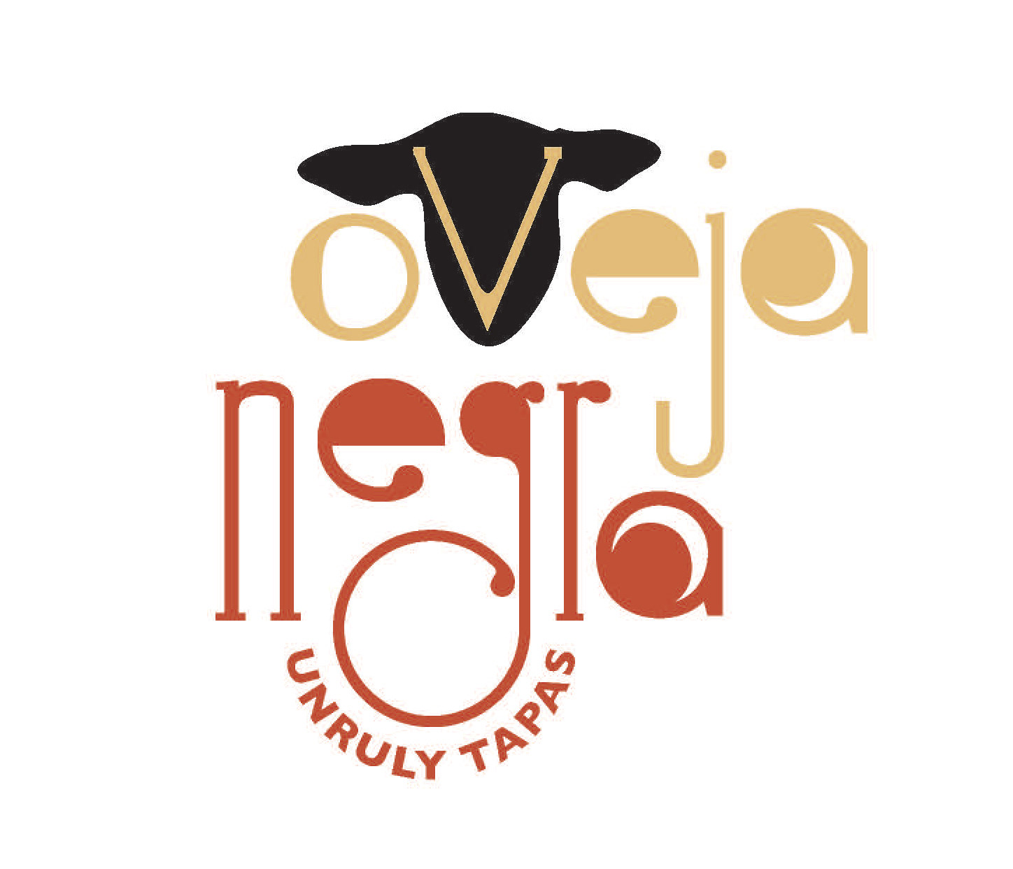
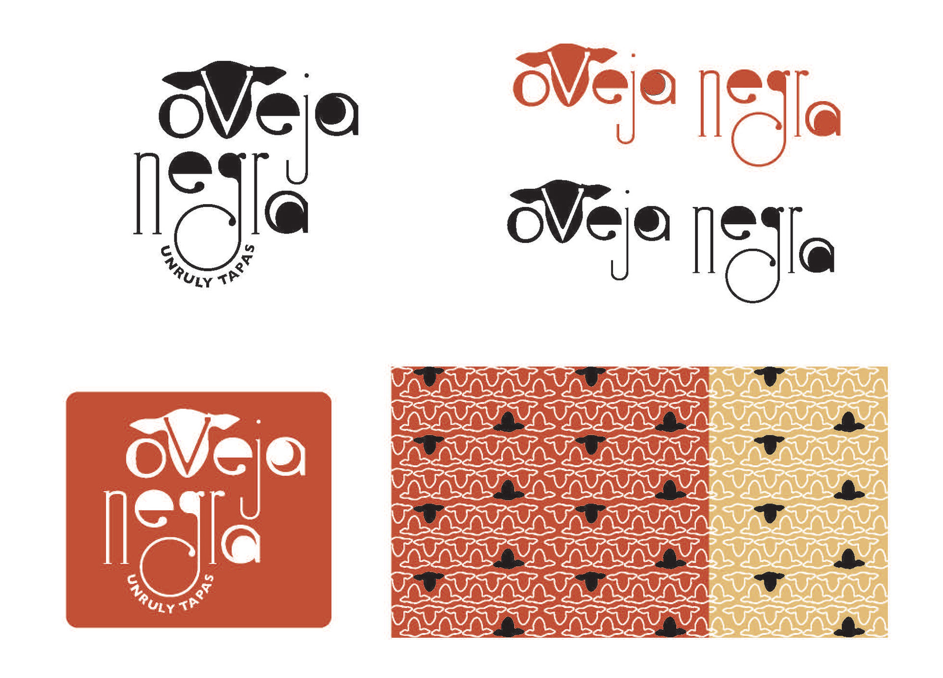
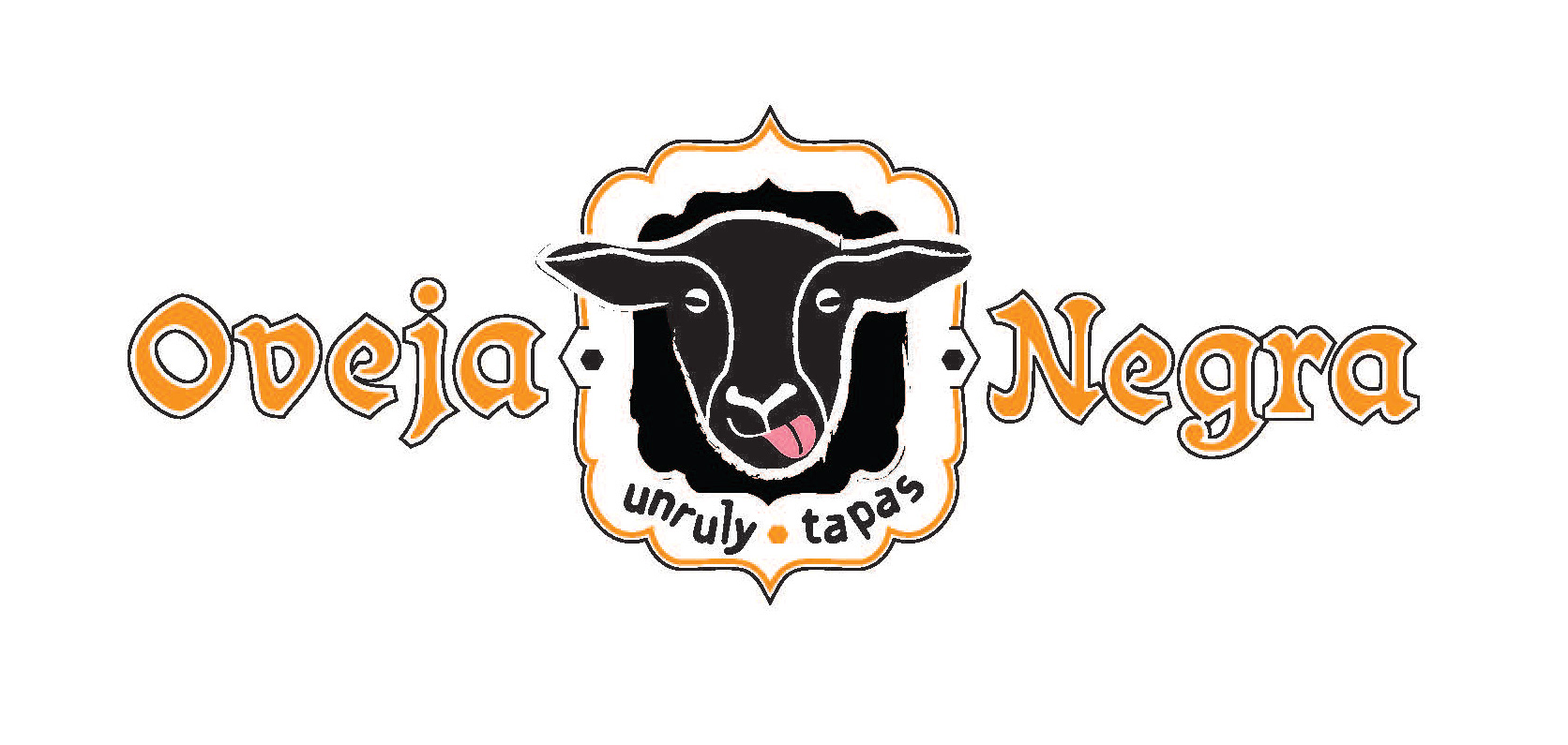
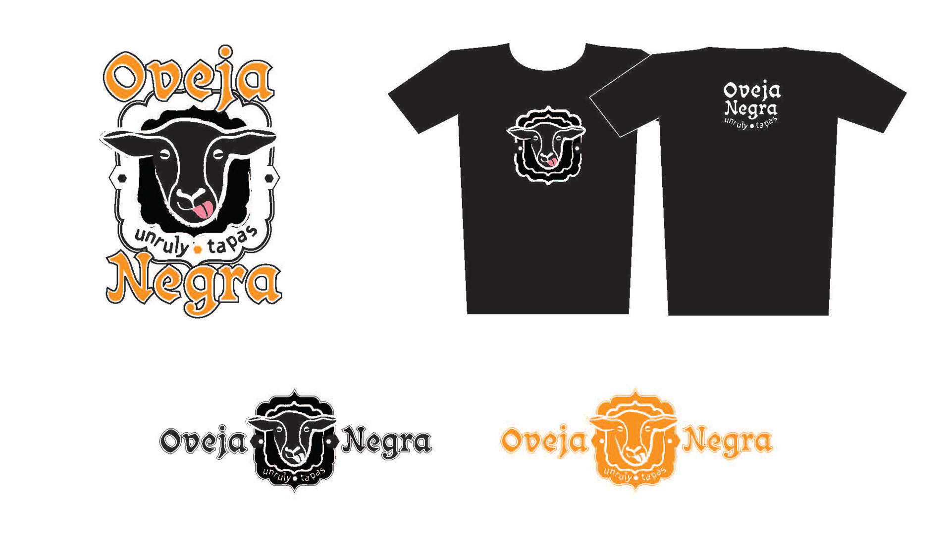
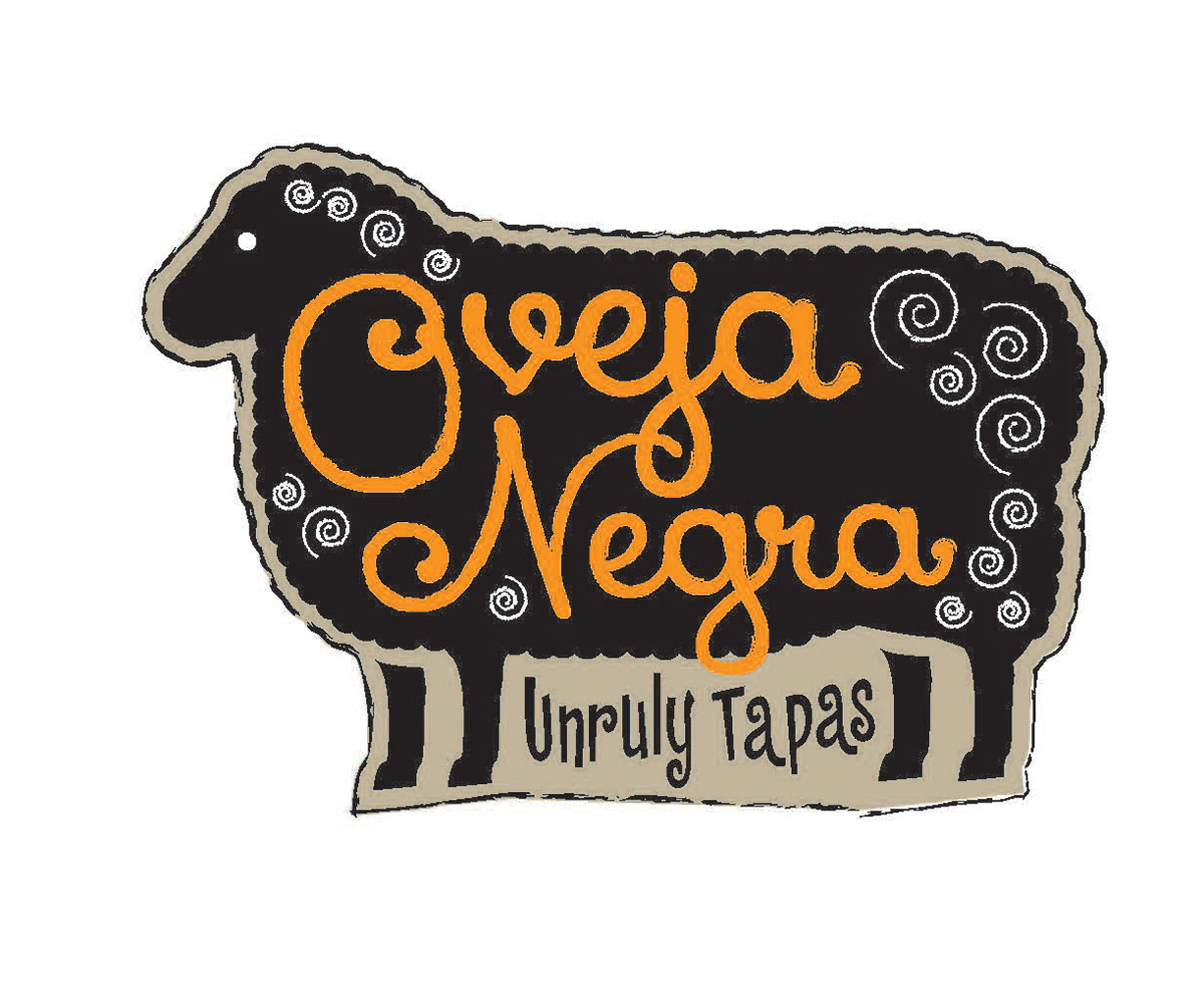
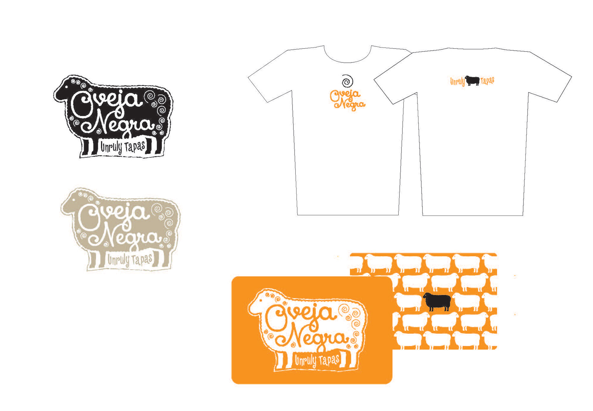
CLIENT . VALENCIA GROUP - OVEJA NEGRA (restaurant concept)
I developed three distinct ideas for the Valencia Group and their new restaurant located in northern California. The logos ideas were well received, but ultimately they decided on a different direction for the logo. This series of ideas and visual expansion shows the type of work I do and the creative thinking involved in the process.
* Project completed while working with Jeff Miraglia, Mindset LLC.
* Project completed while working with Jeff Miraglia, Mindset LLC.
__________________________________________________________________________________________________